Here are two Hip-Hop music posters I have analysed. I have chosen to dot his so I can get an idea for what the poster should look like and what sort of conventions it should include. Also this allows me to gain ideas and inspiration for my own poster so hopefully it will be easier to make as these posters will give me ideas for my own.
This is Jay Z's tour/album poster for his album 'The Blueprint 3'. I really like his poster as clearly a lot of thought has been put into the design and creation of it. If you are a fan of Jay Z or you had already bought/seen his album you would know that he has designed his poster in a a very similar theme to his album. I think this is very important as people might only take one quick glance at a poster so it is important that they can look at a poster quickly and see what it is advertising so then hopefully they will want to buy it. There are some clear poster conventions on this poster; the artists name and album name, the release date/tour date, a contact website and number, the album production company (roc nation) and also a picture of the artist. All of these things are visible almost immidetely which helps the audience to know and clearly see that this is a poster for a music album. Also there a quite a few Hip-Hop conventions within this poster; we can see the colour scheme is quite simple and has only stuck to a few man colours; red, black white/grey and all of these colours are all quite Hip-Hop. Also we can see Jay Z looking quite 'cool' in the picture and not really showing any emoticion which is a charcteristic we might usually associate with Hip-Hop artists. This look is all about being cool, having money and not really being bothered or phased by the people and teh goings on around you. Also I would say that the fonts used in this photo are all quite plain and bold which again are big Hip-Hop chareteristics as you dont want a really fancy font like you might assosciate with pop or rock but at the same time you don't want a too simple font that could be mistaken for more classical music.
This is Nelly's album poster for his album 'Nellyville' note: www.gobaeng.de not part of poster. I really like how the idea behind this album cover is very simple but it looks really effective and professional. Again like Jay Z's poster this poster is in the exact same style as his album cover is has simply been resized and different text has been added to it. This again helps make sure that the album can be linked with the poster and therefore is easy for the audience to make the connection. Also like Jay Z's poster there are lots of clear cut poster conventions; Artist and Album name, release date, picture of the artist and a contact website. All of these elements are necessary for the poster to show that it is advertising a music album and not just a picture of someone. Nelly has also stuck to some clear Hip-Hop conventions such as; keeping a clear colour scheme of dull yellow, white and black. Again we can see we aren't flooded with lots of bright colours but at the same time it is not completely dull like rock/metal poster might be. Also Nelly has chosen some strong bold fonts which again are very fitting with the Hip-Hop image as they are clear and stand out with out being to showy. I think the final major Hip-Hop element is the picture of Nelly himself, this is a really good picture and has obviously been planned. Nelly is looking just past the the audience if you are looking at the picture face on so he is not making direct contact or paying any attention. He has he head slightly titled and some shadow added onto to his face he is almost giving a look that isn't very aggressive but suggests you maybe shouldn't mess with Nelly. I think although this style of pose might not be welcomed in other genre for people who like Hip-Hop they are usually looking for confident artists who don't really care what other people think and worry about there own success and achievements.
From this posters I have gathered some clear conventions of both Hip-Hop and posters themselves also I have noticed how they tend to use simple effects but really plan them out to make sure that they look effective and professional. I will use the ideas and conventions I have gathered from analysing these posters and add them into mine.
This is a poster from Lil Wayne. I love the cockiness of this poster, as you see he is telling his target audience he has money and showing to them by just putting money around the poster that he is rich; This is the typical attitude of a famous big time Hip-hop artist. I love this because it adds to his 'swagga' which he has to have to pull it of : swagga if you do not know what this word means it is a gangster term for a person who has a very high status and with this high status which creates swagga which creates his reputation. He has 2 pictures of himself on this poster showing 1 picture of his face when he is looking away so you see the side of him and another with his whole body looking into the camera. The way this is effective is because the way he has laid the pictures out; the 1st picture of him looking to the side just shows and create that Hip-hop theme as he has the sun glasses on but it has a black background, this just creates that he is unique and he does not care about what people think this is the typical Hip-Hop artist attitude which shows by just having that picture. On the other picture it shows his whole body this means his dress sense is shown to the audience so he needs to have some style so he keeps that 'gangster' reputation. As well on the poster you can see his tattoos which is very common for a Hip-Hop artist to have so again making the whole style and fashion of him perfect to the target audience. On the Poster he has sort of stars which are bright and shining on it; not that many but the few he has are very effective; this creates the sort of rich effect again on the poster as shining normally represents diamonds or something expensive; they have thought cleverly about this as they have placed the stars all around the money making the whole poster overall look expensive. With this it makes the poster as well look more professional as it gives the perfect Hip-Hop effect on it. I like the way he has put the artist name massive so everyone looks at that first; I just love that sort of idea as that name is what people hear all the time if there his fan, that name is the most important reputation he has got, therefore enlarging that and taking advantage of this making him name stand out to draw the target audience to it just by seeing him famous name is very clever. The black background in my view makes it all look neat and better as we focus on the key features in the poster not the background; as the background is simple it just makes the whole poster look more effective. Overall this poster and some of the feature's and key skills they used I may use in my final poster as they look good and effective therefore would be good for a poster for are artist. Very professionally and good designed poster in my view.
This is Kanye West's poster. I love the colours on this poster it just gives that effect that they have spent loads of time on it and it looks amazing and so professional. There are different colours all over the artist face which just make it look so original and different to any other type of poster; it just makes you look at it due to its uniqueness and originality which i love as i hate going with an idea which people have already had and done. Kanye West has his trade mark glasses on which he has used in a few of his music videos this allows the audience to know it is him in the poster as he is 1 of the only artist who wear the crazy weird type of glasses. I love the way the artists name is in the top and the biggest writing to make it stand out as it tells the audience straight away who the artist is which is very crucial as his name is the main reputation he has with his fans therefore having it stand out makes it good as if the fans see that name they go and look at the poster. It is set in a white frame around Kanye this gives the effect that it is like a picture frame and makes the whole poster look more valid and professional. I like the white frame as it is different therefore making it unique attracting the eye of the audience due to its originality. All over the poster there is colour making it stand out to any other normal plain poster; I like the coloured pattern below the artist name as it makes it even more unique also adding to the title of the poster 'glow in the dark' due to it being colourful he will be able to glow in the dark. The background is dark black which is perfect as the title for the poster is 'glow in the dark' and as he is totally colourful with the dark behind him it represents how he is glowing in the dark. The font for the title is sort of space like as it is not normal but you can easily read it; I like this because it shows that they didn't want to just go with the simple but easy idea of simple text they wanted to make a text which could be reed and also notice as unique all in one. The other featuring artists are at the bottom of the poster but in clear text so you can see it easily; this is good because as the audience look at the unique designed poster they notice that at this 'Gig' or what ever it is; that there are other performers who they know and like it might increase the ticket sells making the poster even more effective. Over all I believe this poster is absolutely amazing in my view; the type of idea they have thought of is so creative and it is incredible how they managed to create such an effective poster. I would love to use some of these techniques in our final poster. I am not that good at using the programs such as photoshop to make this type of high quality poster therefore making it quite hard to take ideas from it but on the other hand simple ideas such as large artist name would be easy to use on our album over. 10 out of 10 I believe.
This is a poster of Drake for a tour that he has done. I like the simplicity of the poster in terms of how easy it is to tell that it is a poster for Drake and his tour, I also like the Font he has used because it blends in with the photo well. Another thing which could be helpful is the way in which he has successfully made the poster in just black and white, without it looking strange. The picture shot is a mid shot and suits the poster well, his pose is also good and suits his kind of music because lots of his music is about aspiring to be better than you are, and the way he is looking up portrays this. The lighting effect is also very effective even in black and white. However I do not like the fact that it does not attract the audiences attention, and if you were to see this poster in a subway you may not even look at it because it does not stand out at all, and just looks like a normal poster.
Here is a poster promoting one of Kid Cudi's tours. The main reason this poster is effective is because it captures the audiences eye with the strange colouring, and if you were walking past it you would be drawn to look at it because of the weird colouring. The writing is also effective because it is informative and easy to read, and contrasts with the poster. This is effective again because when you look at the poster your eyes are drawn to the writing and you acknowledge what the writing is saying. I also think the poster is reasonably creative, admittedly it's not the most aesthetically pleasing poster but it does the job it's meant to in terms of attracting attention, and is not something that you would usually in everyday life. The colours are the most intriguing and green, red and black are not usually colours that you would see together.
This poster is very bold and outstanding. I like the use of the yellow as a main base colour. As a strong, bold colour such as yellow has been used, this allows the picture of Kid Cudi's face become clearer to make out and makes his face stand out more against the yellow as the maker of this poster has decided to make his face dark using and black and white setting. This poster is made up of four different layers. The base layer of yellow, the text explaining when and where he is performing, the cartoon images and the final and top layer is the large powerful image of Kid Cudi's face although this has been blended into the cartoon effect which appears they might be a part of the same image. I do really like the way this has been done, it suggests the blend of real life and the fantasy live that many of his songs are about.
This poster is a lot more real life and i feel could be seen as a lot more serious. The colour scheme is this poster is very dark and maybe not so outstanding as many posters. I like the way that the moon has been used in the poster, this is because his album title is the man on the moon and Kid Cudi is also known as the moon man.This poster has been made with five layers. The base layer is the image of the moon in the sky with the trees in the distance, the next layer would the highest on the smoke trials, the third layer would be the main image of Kid Cudi himself, the next layer is the rest of the smoke trials and than the final layer would be the text of Kid Cudi's name, where it is and who he is performing with him. This is my favorite poster of the two.
This is the album front cover and back cover from Kid Cudi's mixtape "Dat Kid From Cleveland" I feel the colour scheme works really well and stands out strongly. i feel the way in which the brown and green have been used from the background, as these are dark colours the brighter colours such as pink, yellow and blue stand out really well for his and the album name. also on the back cover the colour scheme stays the same and the contents on the cd is writen in pink, the track nuumber, yellow for the track name and blue for the artist that is featuring along side Kid Cudi.
After doing much research into the genre Hip-Hop and Hip-Hop album covers we seen that Parental Advisory messages are place on the front cover of most Hip-Hop album covers, this because you will tend to find strong language or sexual content in the songs on the album. This is to let the parental know that there is strong content in the album and is a warning in case they do not want their children to listen to this. Because most Hip-Hop albums have this sticker on their album covers we decided that we will need to use it also to fit our genre.
This is Emeinem album cover. As you see its in black and white which i love as it is back to the old school style, also it may show that his album is maybe sad. I also like just the artist being on it with a black background it shows the audience the artist which they want to see the most on a album cover. I like that idea of just having the artist on as it follows a normal and suitable album cover which relates to the audience. The writing of 'recovery' is in black dark writing and stands out; this is good because it makes the audience have to read it and it stays in there hand;also recovery is a good name of the album as its about Emeinem recovering from what he has come through 'drugs' , 'crime', 'women' and 'children' this shows the audience that the album may mean something to him therefore giving the words meaning throughout the album. The way he is sitting with his hand on his head relaxed but with no happy emotion;this is good because it shows that 'coolness' Emeinem have about him and that 'swagga' they always want to portray, making his characters which everyone believes in stay them same. As well with no expressions it could mean that it is a serious and meanly album cover; the album cover tells the audience a lot about it and is very important to attract audience eyes to it so they go look and it and buy it. His album cover is unique and totally different to anyone else's i have ever seen that's why it is good as the album cover reflex Emeinem.
This is 'Tinie Tempahs' album cover. As you see it is very colourful showing i may be fast paced and happy lyrics; this is good as the use of colour within the album cover attracts the eyes of customers making them go look at it. I like the way he is holding the city in his hands showing he is the king this is good because it shows of his cockiness which a mainstream artist like this needs to have for his characters to work. The kinda glow of him shows that he the king of the city; also the stars in the background is common for his biggest song at that time which was 'written in the stars' therefore it is symbolic to that song. The sunglasses he wears just gives it that sense of being in a different world which is album cover looks like also it gives him that look of a proper rap artist as they need the 'bad' look for there target audience love that quality. The writing on the album is simple but it stands out as it is white writing on a black background therefore it tells the audience which artist this is therefore avoiding confusion. The name of the album is 'disc-overy' shows that maybe it is a sort of dance rapping album which is different to what rap artist bring out therefore attracting the audience to maybe buy it as it is original which is always good. The album cover overall is very good and brings across and attracts the audience to buy it which we need for are album cover.
This is Kano album cover. As you see it is very plain but in my view is very effective as sometimes plain album cover is very good. As you see black background plain and simple but allows the audience to focus on 'Kanos' face therefore focusing just on the artist which the audience care about the most. The writing for 'Kano' is in a weird font which is effective as its different and not just as a normal album cover; this writing makes his name stand out which is most important as his name the audience will know; for example if they have heard him on the radio and didn't know what he looked like the text is easy to read and lets the audience straight away know who the singer is. The name of the album is 'London Town' this maybe showing the audience why he has come from and may hint that his album is going to be about where he grow up and what his children hood was like; this is good because we know the album will have meaning throughout the lyrics and not just made up he is basing the whole album on his past experience which the best songs always come from. Also with this album cover it would save him money as they would not have to pay much for a designer to design that album cover. In my view the simple plain album cover is really good and i believe we should include some factors which he did in are album cover.
This is 'lil wayne's' album cover. As you see the is sitting on a sofa in the background this is very different as i don't really understand the meaning of him on that sofa; maybe it means that he is chilling and this album might be tot tally different to the rest of them. He is holding a guitar in his hand; as Lil Wayne is a rapper and is normal really 'gangster' throughout all his album covers therefore with this guitar it may show that it is totally different. As this album is all more rocky then his rest he maybe showing in his album cover that he likes all sorts of music not just 'grime' therefore creating this imagine of him at the front of the album to relate to what the album is about. His name on the album cover is quite big which i love as it shows the audience who the artist is straight away; as we know Lil Wayne is a huge artist and is well known all round the world his name is his icon and with having it big at the album cover it shows of his most famous feature - his name. The name of the album is 'rebirth' this is a good name as it shows that he different in this album therefore he has been 'rebirthed' as not just a 'grime' artist but as a 'rock'artist as well; him making a rock album it create more audience as it opens to all the people who enjoy that type of music. Overall the album is great as everything on it is symbolic to his album which is what i want are album cover to show.
This is the Collage i created i made and used loads of different types of album covers from the Hip-Hop culture. I did this to get a better understanding of what they look like and to show that i researched into albums into detail. I tried to use a variation of different artists which allowed the collage to be a all round view of different types of album covers. I made sure every album cover on there is the same as are genre therefore giving the whole group a lot of different examples on the collage they can look at for ideas. Overall im very happy with my collage as it shows what my genre identity and style is and gives me more ideas to use for my final album design.
I am going to look at a few album covers so that I can get a feel of what a Hip-Hop album cover should look like and the styles or themes that artists go for. Also I am hoping by analysing and looking at this covers in detail I will be able to pick up ideas for my own album design.
This is Cee-Lo Greens' album 'The Lady Killer' I really like this album cover as it is quite plain but still looks very effective. I also like the use of reflection in his shades which shows what looks like windows and a clear sunny sky. He has obviously chosen to include this and he wants it to look like his life is happy and therefore we might assume his music is quite up beat and happy which it is. This album fits the Hip-Hop conventions because most Hip-Hop artists like to show off what they own as if to say look how much money im worth and you can clearly see Cee-Lo's almost novelty sized ring which he has obviously chosen to wear to show this. Also you can see the album cover fits the title as the title is 'The Lady Killer' and you can see he has his nice shades on, which again he has added to make himself look good and I think it is safe to assume they will be expensive ones not just standard aviators. Also he has a clean white shirt on which makes him look smart and suave and we usually expect womanisers to dress to impress like Cee-Lo has done. Also Cee-Lo hasn't left much room for anything on the cover other than himself, this is typical of Hip-Hop artists as it again shows the message of 'look at me' and we can see him looking quite plain and relaxed and seems to have the cool attitude we associate with most Hip-Hop artists.
This is Kanye West's '808's and Heartbreak' album cover. This album cover is very detailed or complex bit the simple idea behind it is very unique and looks really good. Kanye is quite a controversial Hip-Hop artist and loves to be different and a trend setter. We can see with this album cover he has broken away from the classic style of album cover with the picture of some artist, an effect and some fancy font. Instead of going with the flow Kanye has chosen an album cover with quite a simple design behind it and a simple choice of font. As it is clear to see the album name is about heartbreak so he has represented this visually but instead of using a picture of a broken heart has has used a picture of a deflated balloon being torn by some cartoon styled hands. It looks as if he was trying to create a visual metaphor by representing the broken heart with a lifeless balloon cut in half. I would say the only thing about this album cover that fits the Hip-Hop conventions is the background colour, he has chosen quite a plain grey and usually Hip-Hop artist try to avoid using too much colour as we normally associate lots of colour with pop. But there is some colour down the side which I think he has added to show that although the album isn't as colourful as pop it is more colourful than rock which tends to be very dark colours such as blacks brown etc.
This is 50 Cents album 'Get Rich or Die Tryin'', Immediately the bulletproof, king of the world, no fear super Hip-Hop style ego shines through with the bullet whole on the front of the cover and the fact 50 is standing there topless showing off his muscles and tattoos. 50 has also chosen a very big bold font for his name again to show how big and powerful he is, also he is looking directly at the camera so it appears as if he is looking at us when we see the front cover. Often most people tend to look straight when 'posing' for an album cover but 50 isn't smiling or showing much signs of emotion in his face so he looks more intimidating than inviting. I think although usually and intimating man wouldn't normally be something you would want to see on a product you intend to buy, it works quite well as an album cover. I think most people who like Hip-Hop styled music will obviously have a similar attitude to life so instead of feeling intimidated about 50 they look up to him and might even copy him. I think the glass effect works really well and clearly gives of the bulletproof effect he has gone for.
This is Nelly's album 'Brass Knuckles' it is similar to 50 cents album in the way both show the artist topless showing off the muscles with an intent to look all-mighty. So it is clear that this album fits the Hip-Hop genre as it is very similar to other album covers within the genre. Nelly is very proud of creating his own fashion of wearing, bandanna's, headbands and his trade mark band aid, so as we can see he is wearing one in this picture to keep up his image as the trend setter. It is clear to see a link between the title and the picture straight away as the title is 'Brass Knuckles' and we can see Nelly has his hand wrapped up in tame like boxers would do before a fight. Like 50 Cent and Cee-Lo's album covers we can see Nelly has also made himself the main focus of his album cover so we can see clearly it is his album and we are forced to focus and look at him. He has also stuck to conventional colours like Kanye and Cee-Lo but added some colour again so not to be mistaken for a rock album cover. Also like 50 cent has used a very bold font for his name which I can only assume is for similar reasons to make him look big bold and strong and make sure he is the main focus of the audience.
From these album covers I have learnt that most Hip-Hop artists like to make themselves the main focus of their album in all means necessary and also they tend to stick to colours which are neither to colourful or too dull so they fit well within the genre. My favourite album cover is Kanye's as it is quite original so I will try to make my album cover have a different but intriguing look, whilst trying to stick to most hip hop conventions.
I particularly like this album cover (which is off Kanye west: The college dropout) because it depicts a sad story by the body language of the Teddy bear. The teddy bear is obviously a team mascot and has revieved some bad news, this links with the album title the college dropout. But it's particularly effective because you don't associate a teddy bear with sadness, you associate a teddy bear with happiness and children. I also think the colours are very interesting because you don't really see Hip-Hop album covers with these colours or the border around the main image, so he has pushed the bounderies in terms of what is acceaptable to to with this genre of music and i think this has the potential to influence our album cover massively.
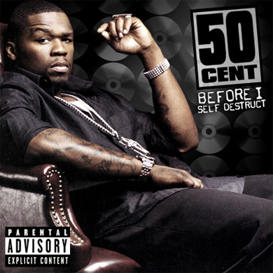
This album cover of 50 cent is another option to inspire us. Although it is completely different to Kanye West's cover, it follows the normal conventions which are associated with the genre Hip-Hop. One of these being a big picture of the artist looking 'gangster' and portrait themselves quite arrogantly which most album covers in this genre do. Although this is less creative as Kanye Wests (above) and doesn't really push creativity at all, it is a good example of how Hip-Hop album covers are traditionally conveyed and could help us with our design of an album cover.
This is another example of an album cover which is pushing album covers in terms of creativity to the limit. What N.E.R.D (originally a hip-hop group have done to there album cover is also shown in there music. They have pushed away from the traditional Hip-Hop music and album cover. There music now has some influences of Blues, Jazz, Tribal and pop music. Therefore they have made an album cover which reflects this, The helmet could symbolise Jazz music because Jazz music was very popular around world war one time. The feathers could symbolise the tribal music which has influence there music, and the man in the picture is pharrell williams, and he himself heavily symbolises creative hip-hop music.
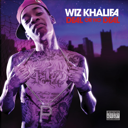
This is the album cover of Wiz Khalifa, Deal or no deal. This is a symplistic album cover which is replicated in his music because it is very traditional hip-hop. The main reason this is effective is the colouring which is tinted into the colour of him and makes him look part of the background, and the background is meant to replify his current city which is Pittsburgh. The reason he is made to look like part of the background is to try and symbolize that he is part of the city, and the city is part of him, although he spent some of his early years growing up in Germany. This aspect of the album cover is something which appeals to me heavily.
From these idea's I think our album cover should have some influences of conventional hip-hop covers by having an artist looking 'Hip-Hop' on the front just like 50 cent, this is to categorise where our music is coming from as we are not an established artist such as Kanye West or N.E.R.D so we can't be as boundless and have to try and stick in the bounderies of traditional hip-hop album covers. However I think we should take influence from Kanye West's teddy bears stance to show vulnerability as our song is about being alone. This could be done by having Josh Grimshaw having a stance similar to the teddy bears stance. We could also use N.E.R.D's representation of the music into the album cover by having a hip-hop/dance background, which the song is. We could also use the colouring of Wiz Khalifa's album because it looks good and purple is not a 'happy' and bright colour and our music isn't bright or happy really.
I really like this shot because it shows what the artist is wearing and that the clothing or footwear is relevant to the music genre. I also like the way the scene is slowed down, a simple way of inputting a good effect to make the music video appear more dynamic.
This shot is effective because as the lyrics start to talk about the sun and heat, they edited the video to make it appear as the sun gets brighter and makes the place seem lighter, this, in practise is a very simple editing technique.
This shot interests me because I like the use of lighting to make the environment seem dark and gloomy, after having most of the music video out in the light. The contrast between light and dark is something that we could look to do our music video.
Overall this music video is something that we can take inspiration from, however allot of the video such as the twisting of the body's and the dancing in the background will be almost impossible for us to achieve. The start of the video is impressive because of the way the artist moves quicker by a jump cut, to make the artist move across quicker without making the video look poor. I also like the theme of going in slow motion throughout the entire video although the music isn't slow it suits it because the at points the lyrics are slow. The way in which the artist is doing things relevant to the lyrics is also very intruiging, such as the laser at around 1.07 minutes into the song.
I really like this snapshot as its amid shot of Fabolous rapping, everything is in black 'n' white other than his hat and tee. I really think this works well as really makes his clothes stand out also it gives us a good sense of clothing which he wears and also links to the Hip-Hop genre as the artists are seen have bold personalities and outstanding, like his clothes in this snapshot. In this snapshot, the viewer is able to get a really sense of the of the the Dreams life style. The stereo type of an hip-hop artist life style would heavy involve very expensive sports cars and good looking women. I also like the way of which the producer has used an effect to make the shot in black, white and grey apart from the car which is in a very bold yellow and very outstanding which makes the car the main focus point of the shot. I like this snapshot int eh music as i really like the transaction and in our own music video we are looking to do as many different transactions as we can to make our video free flowing. I like how this snapshot is actually four different pictures in one also. You can tell one of the layers are a woman's lips, a glass of brandy, a woman lying down with her feet up and silhouettes of three woman dancing. All of these things link to the stereo type of the Hip-Hop genre.
I like the fact Nelly has put a kid in this video and dressed him in the same styled clothes as him. The boy looks good in the clothes but at the same time they look quite out of place. I think something like this could work well in our video. We could possibly include something like this in our video.
I love the use of baseball caps or 'flat peaks' in this video I would definitely like to have our actors wearing them in our video I think for our video to look Hip-Hop people have to dress Hip-Hop and this is a cgood way to do it.
I really love this part of the video when Nelly is almost leading all of these people through a dance class. I think it looks really good how so many people are in time with the dancing, however I don't think we will use this in our video because it would require a lot of organizing and I don't think we could get this many people to act.
Analysis of Video
Again like the first video I analysed (Kanye West - Good Life) there is no real story to the song so again this is represented in the video. However I still wanted to analyse this video because it had a very strong Hip-Hop vibe about it and although it is hard to get a storyline from there are lot of ideas and things I think we can take from this video. The song is quite simple in meaning it is all about Nelly looking for a girl to have a one night stand with and leave. Nelly has decided to be quite 'cocky' in this video as before releasing the song (and album) his brother was released from prison so he was obviously quite happy about that. He has definitely shown this throughout the video as through the whole thing it is clear he is the main person and the one we should all be looking at. He is standing at the front for all of the shots he is in and everyone else is behind him almost as if he were the king and behind were his loyal soldiers. Later on we also see him leading everyone through a dance which again he is the leader and everyone else is copying him because they want to be like him. He has also made himself a role model in this video because we see little children at the start dressed like him so he is clearly trying to represent himself as someone who you can look up to. Also like lots of leaders we see Nelly has to 'deputy's' (Jazze Pha and Jasper Cameron) who are there behind him for most of the video. This is more than likely taken from how kings or army generals usually had there two second in commands by their sides. Half way through the video we even hear Nelly talking about being over confident when he says 'I got so god damn cocky I took my band aid off' this is another reference to his brother as he said he would keep his band aid on his face until his brother got out of prison. Also Nelly is very proud of his birth place and home St. Louis (Missouri, USA) this is shown in the lyrics when he refers to things such as the 'tics which is an abbreviation of St. Lunatics a band Nelly was in with all members born and bred in St. Louis. Also he shows he love for his home in the video because the hats he wears throughout are St. Louis Cardinals hats the baseball team, Nelly is a big fan of baseball as he played a lot as a child so this is also another reason for him to be wearing the hats and for him to have everyone else wearing them.
Generic Conventions
The editing in the video is synchronized in terms of the dancing matches the beat of the song and most of the cuts match the actual rapping in the song however is doesn't run like this all the way through sometimes the dancing or cuts don't quite fit. The shots in this video are very quick presumably to match the pace/tempo of the rapping Nelly is doing. Most shots only last about half to two seconds the video is quite fast pace so the audience doesn't get bored and so it looks smooth and fits with the song. This video is the most Hip-Hop video I have seen yet in terms of matching the genre, because not only does it include girls, cars, and expensive clothes it really over uses them. There are lots of cars, lost of girls and lots of fancy clothes for the audience to look at. There is no way you could watch this video and mistake it for another genre.
Application of Theory
Andrew Goodwin
From the start it is clear this video meets the Hip-Hop characteristics it is also clear that the relationship between lyrics and visuals is very illustrative. From the start we are hearing things in the song and then seeing them Jazze says 'Ladies and Gentlemen' we see a man and a woman, he says 'Nelly, Nell' we see Nelly (the same happens when he says his own name), later on when Nelly sings about a 'pretty young girl' we see lots of woman. The theme goes throughout almost all of the video and only really stops when Nelly is rapping quickly and it would be to hard to through up a stream of images. The visual style of this video is simple; lots of quick cuts and dancing to keep the audience happy and have something to look at.
Laura Mulvey
Again this Hip-Hop video uses the male gaze there are lots of women in this video all very pretty and dancing so it is quite clear us as the audience are meant to be watching them for aesthetic reasons and are fairly objectified.
Evaluation of Video
Although there is no real storyline to this video and no special effects I still really enjoy it. I really like the fact it has clung to its genre and not tried anything out of the ordinary I think sometimes it is good to stick to what you know rather than try to be original. I think some of the dancing in the video is quite good and I enjoy the nice fast tempo of both the song and the video. I also really like the meaning of the song and the way Nelly has tried to get this across he has also made it rewarding for his big fans and people who just like some of his songs, because his big fans or followers will know the precise meaning of the lyrics and Nelly's history and will be able to link this to things in the video which will reward them, also people who don't know Nelly that well will be able to match up things they hear with things they see which will also give them a sense of satisfaction as it makes them feel clever. I would give this video a 7/10.
It starts of with Eminem standing on top of a building looking over the city quite high. The first line is "I'm not afraid" which connotes how he is standing on top of a high building and he is not scared. He is also standing on the edge showing he may not be afraid of falling this start view connotes the first 3 words of the song. Also it shows he is on his own the next lyrics which are said after that are "to take a stand" it shows he is thinking of making something change and he is not scared to do it by himself.
It then shows how high he is up with an above shot this connotes and clears to the audience is not scared and also may show he different and individual. He then goes to high in a room which is quite old and seems lonely may show how he has been trying to get somewhere in life and has kept failing; he then holds a paper in front of the camera maybe showing the audience that his lyrics mean something to him but as he throws the paper away showing maybe he is giving up and how it all normally gets thrown back into his face; showing the audience what he feels like when it happens.
The lyrics say "I'm doing this for me" they show how he is never giving up although he has been failing he will get what he wants if he don't give up. He is still high on the building rapping and showing how nobody can bring him down and how no ones option means anything to him; trying to get that view across to the audience that only your option matters and if you want to do something never give up until you succeed.
He then steps closer to the edge and the camera has a close up to high feet going closer and closer connoting again how he is not afraid justifying the lyrics of the song which he keeps singing. It then goes back to him in the room sitting on the chair with his hands on his head but then he suddenly stands up showing how he is not gonna get down from anybody and how he is strong.
Next shoot is him on the street walking maybe connoting that he is about to "make a stand" for what he believes in and nobody can make him stop; also his lyrics show that he is telling people "there not alone" they have him. A person then walks into him maybe showing how people don't take notice of him and he is going to change that now. He is then trying to cross the road but the cars keep coming so he has to stand and wait this shows what he has been like in his life he has been blocked by people so he could never show what he actually believes in. He then goes to cross even though cars are still coming because its his time to make a stand and show people what he believes in also it connotes again how he is not afraid about anything. Another point about that scene is it may show what was going on in his mind before he started to make a stand; how all the cars are passing quickly showing confusion and madness which could of been in his hand before.
He then looks into a car mirror looking at himself maybe showing how he likes how he has changed and as the lyrics says "i ain't going back to that now" connoting he is proud of what he has become and he will never change to how he was before. Looking into that mirror maybe reflecting on how much better he is with himself. Then theres a room with loads of mirrors in making sure he looks at himself the lyrics says "the black cloud follows me around" maybe connoting how he has done something that he hates and when he looks at himself it brings that memory back the thing he did is his black cloud that follows him due to the fact its inside him.
He then sees a brick in the room falls out maybe showing that he is about to break that black cloud he is breaking free away from the regrets and everything; he then divs through the mirror and he is free. It then goes to the room he smacking the bricks away and the light is coming into the room showing how is breaking free and how it seems better already as the blackness in the room is turning to light showing the black cloud is going away. the lyrics say "starting today I'm breaking out of this cage" this maybe shows how he has been stuck hiding who he really is for to long in himself and from starting to today he is going to be his true self and leave that black cloud he has been carrying from too long.
He gets out the black room and the lyrics say "it was my decision to get clean" he may be referring to drug use and how he has not been himself when he is taking them and now he is going to change for the good and leave the drugs which are the black cloud which has been with him but he has escaped now. He then is standing on the edge of what looks like the end of the world but he jumps and it is time for him "not to be afraid" of quiting and he needs to go through the pain and escape what he has become; the vision is of the world and the black cloud which makes the world look like this he is going to escape that and get back to reality.
He is then falling through the air from where he jumped it may show that he is falling away from the black cloud that has been following for ages its time for him to stand up and not be scared therefore showing him falling and his none emotional face falling with it. It also could show the downs he will go through when he quits taking drugs but then he starts flying up therefore it may show that the down is over and now it is only time to go up and raise to be the true man he is meant to be.
His lyrics then say "i feel the king of my world" this shows that he feels so much more better now he has eliminated the black cloud and it is time for him to enjoy his life. He is flying through the town he don't care no more he is who he is and he is proud of it and whats to show everyone he is no low life guy no more he is here to support his children like his lyric said "hold his responsibilityas a father" this shows he is just here for his family and got rid of the black cloud due to the fact he wants to be a better father for his children.
He then fly's up and goes onto the same ledge that the video started with therefore maybe showing he is still living the same life but he is stronger and a much better man the black cloud don't exist no more, he has made his stand now he can look over the city with his head held high as he is proud of what he is now.
I like this scene because the lighting adds intensity and drama to the music video. I think this use of lighting is extremely effective and very simple. The mis-en-scene is also extremely good because it blends well with the lighting adding a mysterious and dangerous feel to the scene. I also feel the fact that the artist (lil wayne) has his back to the camera and the lightin g makes him look very shady and unknown, again i think this adds to the mystery.
I like this shot shown because it is a simple and cost effective way of adding intensity into a music video, the mis-en-scene on it's own is enough to create a sense of darkness and intensity, but the darkness of the shot also adds to the drama and feeling of mystery.
Overall this music video is a very good video to take ideas from because it has very simple and cost effective ways of adding intensity into a music video. At the start of the music video we see lil wayne walking with a dark background and an interesting mis-en-scene which is the city. The way the camera moves to capture all the mis-en-scene which sets the scene is also very effective and is something I hope to take inspiration from. The clode up's in this music video also add another dimension of effect which adds emotion to the video and fits with the music. The use of different camera angles makes the music video seem alot more versatile and interesting, helping to keep the audience attracted to the video and not get bored. Another simple effect is the way in which the speed is in slow motion for alot of the music video, this fits in with the acrual music which is a slow relaxed song. The way that Eminem demonstrates his emotions by his movement towards the end of the video also helps to show more emotion and intensity in the music video.
I picked this snapshot out as I’m a huge fan of silhouettes in music videos. I feel they are very effective and gives a sense of mystery as you can’t even anything in much detail just see the outline. Also how the silhouette is in black and white which is our groups main colour scheme, so would work well for our group. This may be something we use in our music video or something of the like of this.
I feel this snapshot is an effect but very simple shot. It is simply a track shot and Kid Cudi is just follow while rapping also I like that the use of a low shot has been used as this makes him appear bigger and more powerful. I feel the most effective point of this shot is the mise-en-sense and the scenery in the background. It appears to be in the “hood” which again fits the genre of hip-hop.
I like this snapshot of the video as I feel it really fits the genre and stereotype of a hip-hop artist really well in the sense that he is trying on a suit, this suggests he has a lot of money and likes to look his best which is how hip-hop artists are seen in the media. However on the previous shot of the video it is Kid Cudi in his suit again but in cartoon, which suggests that its at "night" and he is being searched by the police which is the other side of the hip-hop genre, that they are trouble making criminals.
I really love the use of sunset in this video I think it helps add to the video by providing a gentle lighting that we might associate as people being or becoming happy. I also like the use of shadows I think again it is a very clever effect and nice and simple in terms of creating.
This is very simple indeed and is part of the reason I like it throughout the video we often see Travie acting out what he is saying here is making and love heart and talking about 'The ones he loves'. It would be very easy to include something like this in our video and I would like to try and do so.
I love the use of graffiti in this video I think it is used really well although it may be hard to find somewhere we can legally graffiti and make it look good I would still like to try and use an effect like this in our video.
Analysis of Video
The storyline to this video is very simple, Travie wants to become rich and show off his money by treating family and random strangers to gifts of some kind. At the very start of the video we see Bruno sitting on a ledge looking out to the see, it is quite often we see images of people looking out to see when they are wishing or hoping for something as it represents them looking out into this big ocean for a little fish (so to speak). When then see a clip of Travie doing something a little similar looking around wishing and looking unhappy, then we cut to several clips of other people facing troubles in there life. All of these people need someone else to help them and it just so happens that all of there problems somehow link to money. First we see a hitch hiker he is looking for a ride presumably because he has no money to buy travel to his set destination. We see several people driving past and none stop to help him or offer him a lift so he is slowly losing hope. Then we see a clip of a man trying to sell what we presume is a song or album he has made on the street we see some people engage with him and look as if they are going to buy it and then at the last minute they don't, so just like the hitch hiker his problems are seemingly worsening and he is losing hope. Then we see a graffiti artist who has ran out of paint another very inconvenient problem wee see him throw an empty can into the see in anger and can only presume he can't afford to buy any more. Then the main beat of the song kicks in and Travie begins his part. He is talking about what he would do with the money and the up beat tempo of the song suggests things are about to get better. He is talking always about how he would help others with his money and not himself to show how is completely selfless and a true hero, I think he has perhaps chosen to portray himself in this way so his audience look up to him more and want to be like him. Then we see the final person who has a problem and young skateboarder who can't land a trick so lashes out in anger and breaks his board. He now has no board and again we can only guess he has no money for a new one so like all of the other people with issues in the video he is waiting for a rich hero to come along. Then just as the lyrics talk about Travie becoming 'Travie Clause' we release he is now a billionaire in the video and start to see him doing good deeds with his money. He then goes round and fixes most peoples problem he buys a new board for the skateboarder, he buys the CD off the man who is trying to sell his music, he gives the hitch hiker a mini to drive and then he goes off to a party to celebrate his good deeds. Half way through the party we see him buy a bag of spray cans for the graffiti artist and he can finish his art work he has now done all of his duties as 'Travie Clause' and can rightfully go back to partying. I think the reason for choosing to style the video like this was because most people want to become rich and we would all like to think we would be generous with our money and donate to charity and give to others etc. So by creating a video with a storyline that shows this really appeals to his audience as most of them will be young and more than likely want to be billionaires who can do what they wish with there money and make others feel happy as well as themselves. Also some people might have money problems themselves and might think that Travie will help them so they will be inclined to idolize him more as they will see him as more of a hero figure because they are in need of a hero like him.
Generic Conventions
I think the editing of this video is mainly action editing as the main beat of the song is matched by the things we see in the video at the start we see Bruno playing the guitar which is obviously perfectly in time with the song so it look good and not out of time. Then again we see people walking or 'dancing' in time to the beat of the very occasionally we have a few cuts that are on the beat of the song. The shots in this video are all quite quick as unlike the Kanye West video this is a more storyline based video and so to prevent us from being bored and watching one shot for 3 minutes there are lots of different shots and different things happening in the background. I think the mood of the song is represented through the lyrics/song and in the video. This can be seen through several things e.g. the lighting quite a nice sunset usually associated with happiness, also there are lots of people smiling (mainly after Travie has helped them) which again we will associate with happiness like the song is trying to get across. There isn't a lot in this video that the audience would see and immediately think that this is a Hip-Hop video. There is lots of skating in the background which we might often associate more with rock music however recently skating is becoming bigger and more widely accepted in the Hip-Hop world.
Application of Theory
Andrew Goodwin
In this video there isn't much that we would associate with the genre there are cars in it but there not really the fast, sporty and expensive cars we are used to seeing in Hip-Hop videos. This is because Travie himself is different to most of the artist in the genre and has his own take on what Hip-Hop music is. The is some illustrative relations in the video for example when the lyric 'every time I close my eyes' is sung either Travie or Bruno will be seen with their eyes closed. Also you could argue that the lyrics match up slightly when he refers to himself as 'Travie Clause' and is giving things to people although he is literally doing what he saying the lyrics at this point.
John Stewart
In this music video there are quite a few close ups of both Bruno and Travie and lighting is used in a special way because they have used a sunset lighting to create a certain visual effect for the video. Also this sunset styled lighting is seen quite a lot in photographs as it is aesthetic and nice for the audience to look at.
Steve Archer
The video has a big relationship between narrative and performance because the lyrics are all talking about how he wants to be a billionaire and what he would do with his money, and the video is showing you what he would be like if he was a billionaire.
Evaluation of Video
Billionaire has a really good story to the lyrics and I like that Travie has presented this story in his video. It is fun for us the audience to be able to watch him on his travels and him achieving his dream. By showing us clips of people who are in need he has created affection for those characters so we want them to get what there after e.g. a new skateboard. This also means that we will now respect Travie more as we have seen him help out the people we wanted to see helped. So the video has a nice happy ending to it which most people enjoy. The rhythm of the video is also nice in my opinion it isn't too fast or too slow it flows at the right pace for us to follow the story but without getting bored. There was a lot of visual aspects for us to watch we saw people skating and messing around on scooters/mopeds and both of these things could be quite fun to watch in real life so therefore are also enjoyable in a video. I think this video has ticked most of the boxes that the audience has and is a really good video to watch I would give it 8/10.
This song is a great idea and keeps it simple but gets the meaning across to the audience. The first shoot is him holding his arm across his body and is a low shoot just on his lower body; this shows that he is hurt and that he may he hiding his emotion to the camera, this creates and shows the audience that this stage in the song is emotional and creating that feeling over to them. This is a good idea because it sets the type of emotion from the go just from his body language, we are going to use this type of technique at the start and all the way though are music video because it sets the scene of emotion either if it is happy or sad and shows the audience therefore avoiding confusion.
The camera work also shows the emotion of the song when the camera is above him showing he has no power and is weak due to the fact of his sad emotion. His heart is red and pumping showing he is singing with his heart and it means a lot to him; maybe it is significant for his love. Also it keeps going outside and showing the audience the weather out there maybe showing how he is feeling inside, which is cold and wet like the weather being shown.
A great way they showed emotion at the start was when Chris brown said “i hope you haven't said it to” looking straight into the camera for the first time showing he means that line and it shows how emotional and important it is that the girl of his dreams wants him. It goes to the girl he is singing about and behind her is a bright light which may show his happiness when he is with her and it lights him up, instead of the cold feeling he is having at the moment.
It then goes outside and they are all taking pictures of her and how much attention she is getting maybe showing he believes and thinks he is not good enough for her; also it shows her getting in the car driving away from him showing that it is his last chance to try to get her and tell her how he feels. As well as he is walking away from the situation showing maybe he has gave up on her but her look as she looks back shows she feels something for him back and he has got a chance.
The weather is snowing on him showing how he is cold inside without her; maybe showing his confusion in his head also as snow falling shows all the thoughts in his mind. Shes walking in the same direction which shows it is meant to be as they have bumped into each other 3 times now. Now he is above the camera showing he is happy and no longer sad as; this shows the whole song was about the girl and shows how much he likes her. The smile on his face when he says goodbye shows his happiness and his dancing shows that the girl is his ideal girl.
Then the scene suddenly goes to the dessert which is hot and sunny; this now shows what he is feeling like now, happy and warm inside. It shows how this girl can change his emotion from cold and snowy like the scene earlier to warm and happy like the desert. He then looks into the camera and holds his heart and covers it showing his heart is taken and she has got it no one else can take it away from her.