Showing posts with label Josh S. Show all posts

Sunday, December 26, 2010

Evaluation Question 4


Technologies
Throughout this project we have all used lots of different software/hardware and websites complete certain tasks. Each of these has provided its own unique functions and has somehow helped us to improve our project and make certain things possible here is all of the programs/technologies we have used and how we have used them.


Websites
http://www.blogger.com/http://www.blogspot.com; This is a website which allows users to create a blog were they can create posts and share there thoughts with the world. We used this site so that we could post all of work online and keep track of it. By using a blog we were able to edit posts and use and easily add resources off our computers.
http://www.youtube.com/; This is a site to upload and watch videos it is a great website and use by millions of users. We used this site to analyse other videos for research and to upload our own videos so that they could be watched by other and shown on other websites (e.g. facebook)
http://www.vimeo.com/; This is a similar site to YouTube however it is less popular but equally as affective for uploading videos. We also used this site to upload of video so people who don't use YouTube could watch it and hopefully we could gain more feedback
http://www.animoto.com/; This is a site where you can create short videos using media you have already stored on your computer it also has built in affects which allow you to create a professional looking video. We used this site to create our pitch because it is a great way to combine lots of media (pictures, music and text).
http://www.scribd.com/; This site allows you to upload word documents and turn them into a virtual document where you view it as a picture but you can still navigate through the document and select text etc. e used this to upload most of the work we had created in Microsoft word.
http://www.myspace.com/; This is a social networking site that allows users to communicate with lots of other people online it is also a great place for keeping track of artist. We used this website to help advertise our artist.
http://www.facebook.com/; This is a similar site to Myspace but it is more popular and not really used for music. We used this site to communicate with each other and to gain feedback for our videos.
http://www.twitter.com/; This site allows people to post short messages usually of what there doing at the time and broadcast it to the world other users can they follow the person to get updates from them. We also used this site to help advertise our artist.
http://www.slideshare.net/; This website is similar to scribd in the way it allows you upload documents so they can be converted into a  format where they can be viewed on websites, however this site is mainly for power points. We used this site to upload our power points to our blog.
http://www.bbc.co.uk/; This is a news/TV website which has information on almost everything latest news, sport weather etc. We used this site so we could look at the weather to help us decide when to film.
http://www.wikipedia.co.uk/; This website is an online encyclopaedia is has information on almost everything and we also used this to advertise our artist so people could help find out about him and his background.
http://www.google.co.uk/; This is a search engine which will produce results for most searches made. We have used this site to find images for our research and to help us find everything we have needed to create our video.

Hardware
- Computer; We have used a computer for almost all of the tasks for our music video we have sued is to visit all of the websites and also to edit our music video.
- Mobile Phones; We have used our mobile phones as a means of communication between each other and also to take pictures of our filming, locations artist etc.
- Panasonic Video Camera; This is the video camera that we all decided to use to film our music video.

Software
- Camtasia Studio; This is software that allows you to record what is happening on you screen (screen capture) we used this software to record our editing and also to get some clips for our research.
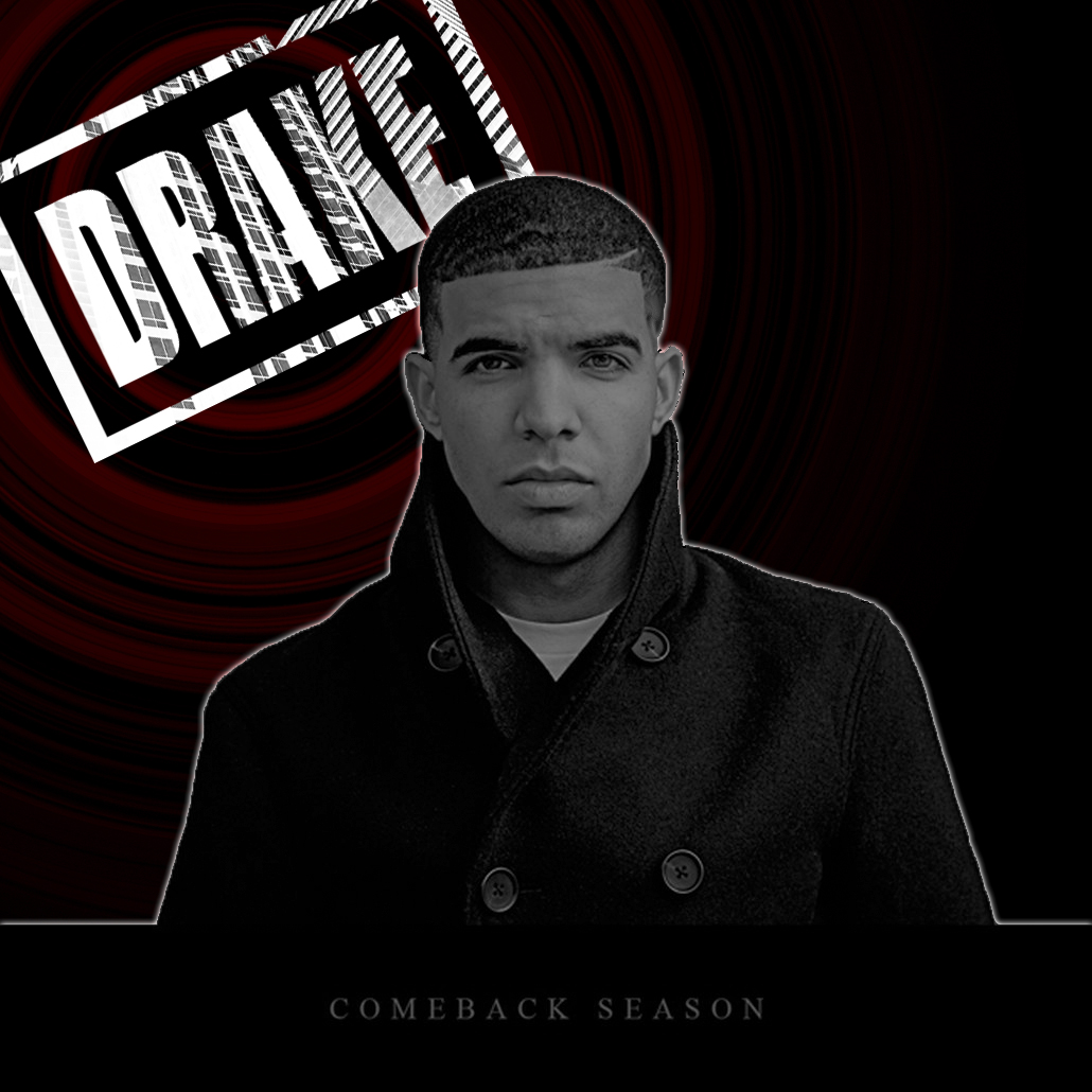
- Adobe Photoshop CS2;  This is software that can be used to edit pictures and to change them to how you want them to look. We used this software to edit pictures mainly the ones for our album cover but we also made some pictures for our research and to help make our work easier to understand.
- Sony Vegas Pro (8.0); This is a professional editing software which we used to edit our entire video after filming it.
- Sony DVD Architect Studio Pro; This is a software that allows you to get video files off your computer and burn them to disc we used this software to burn our video to disc.
- Microsoft Office; We used this software to create all of the work we couldn't complete on blogger, this software includes Microsoft Word, Microsoft Excel, Microsoft Power point and a few other software's but we did not use those.

Thursday, December 23, 2010

Evaluation Question 1

Evaluation Question 1

 For question one we decided to make a cribs video that would show where we filmed our music video so that we could go round or location and talk about all of the places where we filmed and how they have fitted or not fitted in with our genres conventions. Also we decided that this would be a good idea because it meant that we could talk about all of the props that we used in our music video. We used lots of hip hop props to make our video look more realistic and we thought that using cribs would be a good way of being able to talk about them.

Wednesday, December 22, 2010

Cribs Location Idea - Evalutaion

We wanted to create a Cribs video for are location to give it that unqiue and different to everyone else boring and common pictures of there location. We will be doing the picture post on the location as well but we wanted to add something extra which no other group would have. Our idea was to create a cribs location video which would include the whole location but it would be acted like 'Grim' showing hus house which was actually the whole location we used. We thought this was a very good idea as it made us use more connsepts within are whole blog.

Here is an example of a Cribs youtube clip:


As you see he shows the audience his house 'Crib'; i love this idea as it makes it a better and more fun way for us to explain are location. He has got little clips of his music videos within him showing them round his house; I like this because it adds to just the location because it is showing the audience a little background of lil waynes music videos as well.  I like the way when he shows something they do some sharp shots within the music video just makes it look more proessional and better. This example is good because lil wayne fits are genre and as you see in there he shows of his money with his diamonds; this creates the normal Hip-Hop artists character and is needed to make them and give them that 'Gangster' fashion. Also he shows of his money with his cars again bregging and showing his cockiness which a artist of his genre needs to have to make people love them - just the way this genre is, its all about money, girls, cars, diamonds and there songs basically the Hip-Hop culture loves money.

Tuesday, December 21, 2010

Communication and Organisation


We used  facebook to communicate quite a lot, this allowed us to talk to each other for free and simply. We just set a time when are team needed to come on to talk about what we need to improve and also what we thought was good and bad about are music video at the present time.

We used a feature which allowed use to create a group for are media project and with this all are team and write on the wall saying what they thought of the days work or a message for the team if there not online. This is good because it allows communication to be good and effective as the message will get through to them even when they are not online. With this feature it allowed us also to have a 4 way conversation on the same chat therefore with this we can throw all are ideas or criticism onto one chat making it overall better as we can all discuss as a team what we plan to change etc.

This is a different way to communicate and it made us different from just texting and calling each other. We also thought as this type of new technology can save us all money on credit due to the fact we needed to speak to each other quite a lot when were doing the work; just in case one member got confused.

Facebook has became the best social site nowadays and with this technology were using to communicate we can all get create feedback from this site as together we have a total of about 3000 friends which will give us feedback allowing are project overall to be much better.


Also one of are members has just passed his driving test and has a car at the ready with insurance all paid for. This is good now due to the fact we can go anywhere in reason with this car, making are locations which we thought were to far away easy to get to and record.

With this car we can also pick the whole group and have a group meeting. This is good because we can discuss are feedback about are media project face to face in a mature group meeting; this allows all are idea to be known within the group.

This new feature within are group have allowed us to be able to film anytime any day therefore the night scenes we do not have to worry about the transport due to the fact we have it all sorted now. This overall it will make are music video so much better because we were having trouble filming at night; and with this car we can get these shots we have be dieing to get.


Sometimes we e-mail each other to see if were all doing good with the jobs we are doing. Also we e-mail each other to send information or pictures across with ease. Mikey is the leader of this group and he often asks and makes sure my work is ok and i know what I'm doing. These little e-mails make are communication better overall.

We are using all different types of communication because we want to show how we have different types of original features to communicate and do not just relay on one feature. With this it makes sure we can also speak and talk to each other because for example if facebook server is down we have other ways to communicate.


This is are admin privileges on blog spot. Mikey is an admin of the blog as he is the leader of the group so being an admin allows him to edit our posts and make sure they have the correct labels and  the blog posts are titled correctly. Also it allows him to organize the way the blog looks so he can add picture like the header picture that says 'Black N White'. Overall this improve the organisation of the blog.

Problems with communication and organisation

We had a few problems with communication and organisation which created us to lose time for filming and doing certain tasks.First of we could not get hold of some actors when we needed extras to be in are music video this meant we had to get a male actor for a scene which we needed a female actor making are media music video not look as good as it could.

1 other factor we had was when we needed to film some of are group where busy and we all were busy at different times making us have to cancel plans and sometimes miss some filming time out as we all had personal stuff to do after school. This is not good because it means we have to film on days which we all are not busy which will only be 1 day a week; on the other hand we could cancel the personal plans 1 time a week therefore upping are filming time to 2 times a week which will be much better for us.


Monday, December 20, 2010

Final Digipack And Poster Feedback


This is my final album cover. I posted it on facebook to see what the reaction would be as you see everyone went wild for it; there were 30 odd comments but I could not fit them in on this screen shot. Also there were 33 likes to my album cover which I was very happy about. Everyone was saying how good it looked and how effective it was. I'm very happy with this feedback as it makes me feel like I designed and picked the correct final album cover as everyone seemed to like it. I used a different technology but the best way to get feedback in my eyes; as i have all my mates on here it is easy for them to like it and comment also it is simple to do and takes 2 seconds to post on. This idea i liked due to how big facebook is and how many different types of people I had on facebook; even the people who didn't like Hip-Hop seemed to like the album cover therefore i'm very happy with what I produced.

This is my final poster for Grim. As you see i posted it on facebook to see what my mates thought of the poster - this technology is very good as it made my life so much easier being able to get the feedback i wanted. I was scared at first to see if people liked my ideas but as you see it went down amazing with my friends. 52 people liked my picture which I was amazed about this showed to me that it was good and effective to my target audience; I new this because most my mates on facebook like my type of Hip-Hop genre we had therefore I am very pleased with the feedback I got. Also 30 plus comments where made but I could not show them all as they would be to big picture. Overall very happy with the feedback I got as it allowed me to see if it actually looked good or not from my mates point of view therefore extremely happy with what my final poster outcome was.

Saturday, December 18, 2010

Final Poster


After 2 drafts of poster I have finally finished my poster. After my first draft I thought I was way to crazy and colourful to have as my poster therefore I decided to do a new poster. On my next draft I mad a really good poster but again I forgot that I had to suit it to what colour and theme my album had therefore I had to do a 3rd poster which is now here.

As you see when I was designing this I had to think about the colours so they matched towards my album; this was a key part to my task and if I did not succeed this part of the task where the album and poster should be the same colours and match a little I would not be able to get full marks. As I was making this i looked at the album cover and seen that most of my album cover had the theme and colour of red making me easily choice to have mostly red on the poster (well for the main parts). This is good because then they can match the poster they seen to the album when it is released. I started of by the Top header which i named the album name of course so it stood in the audiences head; I did this because they will need to remember that for when the album comes out therefore when they see it they think about to the poster and then buy it due to the advertising technique. If you look closely into the title you can see the whole word is repeated about 10000 times inside ambition so the word ambition in little words make the big title ambition. I did this to show of what I can do with photoshop also to give the post the professionally look; as well as with this marketing technique when the customer looks at that title there looking at loads of different words which all say ambition again making the word stick in the audience head much more. The red font made it stand out and also fitted what the titles theme colour was making them to look like there part together which I wanted. The title standing out is good because it catches the audiences eye, even if they walk past and have a quick glare that word ambition will stay in there head due to how much it stands out. I then wanted the Title to look even more better and professional so I made the shadow of the title underneath it; this gives the effect of originality again as not many posters use this effect therefore again making my poster be different from others meaning it will stand out even more.

I wanted to keep the background plain and simple so the important bits stand out from everything else; I choice to take a risk and leave it white as most posters insert colours in the background, again I want to be different from just 'every other poster' I wanted mine to be better then every other poster, I wanted mine to be different then every other poster therefore I just left it white. I think this was a very good idea because if you look at the poster at a whole the key and tricky effects I inserted stand out more making the audience respect how good the poster actually is. Also this saved me time trying to find a good background which compliments the pictures, text and title therefore overall a amazing choice in my eyes.

I then needed to decide where i would be placed within the poster now and what i would look like. It flashed back to me at this moment that on my album there where 3 pictures of me all on different covers but altogether 3 pictures. I thought to do a skilful move and maybe insert 3 of me on the poster not many people will notice but again it will be following the theme of the poster therefore getting my grade up higher. With then i have to decide to get 3 picture of me 1 in the middle , 1 in in the left and 1 on the right; these pictures I wanted to have the cool look and have the Hip-Hop culture 'swagga' look again therefore I had pictures with his hood up making him look more 'gangster'. This is effective as it still has the Hip-Hop theme which I have carried on all the way through making these products and researching of the poster and album.  If you look closely to Grim you see that all over his body is writing again I wanted to make it totally different to other people posters; i wanted my poster to when a audience member to see it they just thought 'wow' that's why I made it completely original and effective. All over his body there are 3 words which repeat our; 'Grim' '13.12.2010 (album release date)  and 'ambition' I including every single main important information all over his body so the messages get across to the audience; this is a clever technique as all the way through when they look at then poster all the key information I want to get over to them is running through there mind as it is everywhere on the page. The writing on his top is red so I carried on with the theme of the album making sure it suits and looks similar then what the album looks like; due to how the poster is about the album it has to have a similar theme to make it match. When the writing goes down to his trouser it turns to black and goes darker this is because the writing needs to disappear and stop before it starts going of the page therefore this is a key point for me to be able to make it stop with it looking like it was a professional job.  Also if you look a picture and focus on some words you can see that i made ambition stand out on his body again; to me this is the key word I want this word to get stuck in there head until they see it in there local shop and then they remember where it was from key to me for a create poster it has to have 1 key word which the audience remember after reading it.

After I have made my Grim photos look to the standard I wanted them to look I then had to think about what writing I would have on the poster. I wanted to show when the album was out and make that stand out therefore they know that information from the poster; I decided to put it as a sort of stamp so it looked different again; also the writing stands out so it is simple and easy to read for the audience who read it. The date is clear so they know exactly when it comes out making sure that stays in there head even after they have left the poster. I like the boldness of everything of this due to how it is very important this date is if there a big fan ETC. The placing of this is perfect as it is just below the title on the right also on a diagonal sort of layout which gave it that different factor again making it original even further. I loved the whole way it was laid out and the font style also the boarder it just gave that sort of professional style and overall I thought it looked perfect for my poster.

I then thought I had to insert our 'twitter' for him so if they were interested they can find out more information about the artist therefore getting the latest about his album ETC. I wanted this on here so there is more information about him so they can find everything out if they wanted to know anything more. I put it in basic easy to read writing so the audience will have no trouble reading it avoiding confusion. I made it quite small due to the fact I didn't want it to stand out as much as the most important information therefore making it a bit smaller solving all the problem I thought may occur.

I then thought i need some reviews due to the fact every poster needs some good feedback to make the audience think that it will be good because of the rating they got. I didn't just want 1 feedback from a big magazine Hip-Hop company I wanted 3 to make the audience believe and think 'if there getting this feedback from these magazines its got to be good' this is amazing market technique as it is showing them its good before they even have brought it making them want to go and buy it. I just included normal black stars as i wanted to keep it basic and black is a smart colour making my magazine look even better overall. I changed the colour of each different magazines title name due to the fact i wanted them to know there individual giving them there own colour showing there all different giving the impact to the audience that the feedback is amazing. Also the writing was easy to read therefore avoiding confusion for the audience.  I think it is effective as it fills more room up for the poster and gives the poster a much better feel to it in my view. Just overall makes it better.

I then needed to think about the record labels local and where it will go; I needed a record label logo within the poster to get the higher marks also it will make it look even more professional. I choice to put it in the bottom right corner as it was a easy and simple place to insert it. Also it is a common to place for the record label down there, therefore I went with the crowd and inserted it there. It is half black and half white therefore  connoting what the record labels name is keeping it simple but effective. This is good because it was simple to do but it also has that professional effect on the audience therefore making my poster overall better again. There is a white border for the bottom bit to make it look different to the poster bit as it is the key information showing the relevance between them. Also the white box made the font easy to read therefore avoiding confusion for the audience.

I then thought i need to tell the audience who he actually is; I had no room anywhere so I decided I should put his name going down on the end of each letter within the top title. I thought this was good because it was different to a normal and topic choice of placement for a artist name therefore I loved it as it was total unique and original making it stand out from the crowd. I wanted to put it down the end letter of A and N so even though its quite small there are 2 of them therefore the audience still notice the name making them aware of the artist. I put it in black so it stood out and is easy to read therefore the artist wont miss it on the poster. Overall I think his name was needed to make the whole poster perfect therefore overall i'm very happy with this choice.

Finally I needed to put the website of the artist on the poster so they can look on that for further details making sure if they like the look of it they can do search and check it all out on the internet. I inserted the website in the bottom left corner so it didn't stand out but is easy to see for the audience to see it therefore it comes in use.  I used the same colours as the record label for the website as it fitted it well with that bit and it made it look more like a theme then different colours all over the place; this makes it more effective and better to look out for the audience. Also makes it look more professionally done and also looks like I have took time planning the poster which I have.

Overall i'm very happy with what I produced and after 2 drafts of such hard work I managed to pull it out the bag with this 1 I think; everything I did on the poster I did for a reason and it all adds up to make it even more effective. the poster just in my view after I have explained it and I look back on it just looks amazing if i'm going to be big headed ;) love it in my view :D

Problem

Upon realising the date of the 13th being a Sunday I would of changed the date of the whole design to the 14th, however an underlying problem of photoshop features meant that through the development of design I had to rasterize the text layer inside the person to overlay the images to give the effect of the word making up the artist. This then meant when I went back to edit the image I couldn't change the text layer therefore I would of had to redo most of the image again and probably would of lost lots of the key elements which make the design key.

Here is an example of the poster in a bus stop


This is a prime example of my poster in a bus stop; as you see it looks effective and good therefore I am very happy with what my final poster looks like. It also looks professional and realistic which I love as well. Overall very happy with what i have produced.

Sunday, December 12, 2010

Draft Posters


I created this poster on photoshop for the artist 'Grim'. As you see i analysis Kanye West poster which was a sort of cartoon effect and had loads of colours to get the audiences attention due to it being eye catching. I wanted to make a unique and crazy idea for the poster therefore i went for a poster full of colours to give it that effect of originality. When i started i thought to start of with where i will place the artist within the poster; i decided to position him big and to take up quite a lot of the poster as the artist the main focus within the poster. I did this because as i researched into common poster i seen that normally they main the artist huge to stand out so i copied this idea and placed this within my poster. I made him look quite cartoon like to create the unique effect on the audience; i don't like following normal and common ideas and i wanted to make the poster stand out therefore adding this type of effect onto the poster gave it that craziness and weirdness of a different poster. I then needed to focus on where i was going to put his name within the poster and what font style and colour it will be; for this i thought long and hard trying different types of fonts and positions. I eventually thought i got a amazing font but with the idea of green being around it in the background of it. I decided this as i picked the most colourful colour for this background of his name because as i have explained before and as Lil Wayne's poster reflex's; the name of the artist is probably more important then them being within the poster due to the fact if someone don't know what they look like and have just heard there name on the radio they can focus on his name reflecting back therefore knowing who the artists is. The background to the poster is all just about different colours mixed together with different shapes making a crazy background which i love; this is good because it stands out and is eye catching which was the effect i wanted to create with the poster making the audience want to buy it/ go and look at it. I added the green glow from what was around the artist name around the artist picture of himself; this links them to together showing that them to are the same people, i did this so the whole poster was relevant and made sense. Also i did this because it avoids confusion the audience may not of linked that 'Grim' was his name but with this little colour technique it gives that little link between his name and his picture. His earring i had to make brighter so it stood out a bit making him seem more like a Hip-Hop famous artist as it is common for that type of artist to have piecing with big diamonds to show of there money and to keep that 'gangste' style, fashion and look. Overall i am very pleased with this poster i have made due to how unique it is; i focused a lot of my ideas from Kanye West poster cover which i analysed this helped me a lot as his idea and poster was amazing. I created something which was eye catching and good to look at which a poster should be. I wanted to show that different is better then simple and normal therefore making the poster totally original.

Here is what the poster will look like in a real situation


I took a picture of a bus stop which had 2 posters on; i edited 1 out and inserted my picture to see what it would look like in a real situation and if it was effective. I liked this idea but seeing it on the poster made me real i wanted to make a better looking poster. As this was only a draft it gave me a good idea how it looked and what i could do to make it better. In was a good quality poster but in my view i think i could make better.


I decided after draft 1 I wanted something which did not look to complex, which stayed to a simple layout and was easy to understand for the audience. This is only a draft therefore I will not go in detail why i chose to certain things within it, as my final poster is exactly the same but changed in colours and little things within the poster. I needed feedback from my teachers and I totally forgot about the relevant of it having to be the same colour/theme ad the CD. With my poster having no relevant to the CD cover it would drop me down marks left right and centre therefore I needed to edit this poster and make the colours match with what colours were on the CD cover. It is not a big chance so I had no issue changing this to make it fit. This was good how I learnt from my drafts to be able to produce a good and high quality poster.

Wednesday, December 8, 2010

Draft and Final Digipack

We didn't have a decision on the name of the album at this point so i named it to what i thought was a good album name making when we decide the feel project we have more ideas for what to call it.

As we all had to create different covers separately i had to make sure my covers were up to a high standard. I  decided after 2 days that i did like my first album cover design therefore i started again but this time i made the front cover, back of the album, behind the CD cover and the cover next to the CD therefore all together i have 4 covers for the album. This at the end will create my own digipack. Also i may print it off on a CD and show an example of a live model therefore showing the audience what it looks like in a real prime example.

Front Cover 


This is the Frint cover idea i thought of which i made on photoshop. I made a draft before i started to make my real idea just to get a feel of photoshop as i have not used it for a long time; with this practice it made sure i new i could  still use photoshop ad allowed me to see what sort of standard i could produce. I was not happy with my first design therefore i made a new album cover. I wanted to create him cartoon like on the front cover to make it stand out from the rest of the normal and boring album covers; i like the way it looks as it is such a simple picture and i have made it look so effective with just making it look cartoon like. The pictures i inserted were just of him looking down on the ground and the camera was above him. I needed to insert the 'parental guidance' on the album due to the fact all my research i have done on album covers mostly every Hip-Hop album cover has this icon making it common to the attitude of the Hip-Hop culture. It also adds that look of professionalism and makes it all look even more realistic that it is a real album cover. The bars in the background i wanted to be sybolic to music bars and as it goes higher the music goes higher adding that effect of a high paced album due to the fact it is very fasted pace througout. I wanted 3 pictures of him all the same picture but reserved because it looks good and is very unique idea; also the artist face us everywhere on the album which is a key marketing techinque as if the audience see his face and heard his music which they liked they will go and have a look at the album. I got this idea from a 'oli murs' album cover as he had about 6 of him all in different shots. The white and red theme went well with the clothes he was wearing therefore i added this into it so the background compliments his clothing. The artist name is in black font so it stands out and the artist look at it; i decided to make the 'm' in grim drag a little down the page. I did this because it is tottally different to what a normal album cover artist name would be done as therefore i added that orginal effect and made it stand out from the crowd. The album name is near the middle going down; it is in black font again due to the album name is about the album how he has had a abition to be a music star and now he has it. I again wanted to be different and not be boring and simple therefore i made it go down the page and not go across again giving it thet unquie effect. Overall im so pleased with my idea i created, it stands out which i wanted to do, looks professionals and is up to the high standard which i wanted to produce therefore i am very happy.  

 
Back Cover


This is the back of my album cover I made on photoshop. As you see i wanted to try to make it basic to design but look good as well. I had to start by thinking what colour the background should be for the back of my design; my first thought was white but I believed that was too simple so i decided i was going to make the back white and grey because it stands out and also it is easy to find a text colour which suits that background and also is easy to read. I split the colours in section so it did not just look boring and simple; it was in a circular format going diagonal up the page giving it that extra professional touch. I then wanted to insert some colour into the back therefore adding the bars which were on the front page onto the back; this carries on the album theme making it suit all the way through. The bars go up and down connoting music bars showing how it goes high and low; this shows that the album may be upbeat and different some songs may be quick and fast beaten, and other may be slow therefore making the audience wonder what the album upholds. I inserted the bar code onto the back to give it the realistic feel to it also showing me what it would look like when it was in the shops as the bars always get stuck on. I placed it at the bottom corner in the right to follow where it normally would be placed; i wanted to go with the crowd in this section as if it was placed anywhere else it may confuse the audience; as well as if i put it bottom left it would cover the bottom song. As well if I placed it at the top it would look out of place therefore the bottom right was perfect for the bar code to go. The song writing stood out in black writing which was easy to read so the audience can read the song titles with ease; also I made sure the colour of the text complimented the background so there was no hardness to read any of the album. The 'Track List' was bigger then the tracks so the audience new what there were reading and for the audience members who lacked commend sense avoided them to get confused. Over all i'm very happy with the back of my cover as it was easy and simple to do but also had that professional feel towards it; I made sure it followed the colour theme from the front cover  so the whole album went well together. I completed it to a very high standard in my view making me overall very happy with it.

Cover Next To The CD


This is the cover next to the CD. I wanted to be able to follow the theme of the whole album cover again therefore I used the same type of I used in the front page making it follow the whole theme of the rest of the album. Also the colour I made sure it was read and black due to the theme there where no bright colours within it and no variation; therefore I could not break this I had to carry it on within every page of my album. I based 'Grim' in the middle of the album due to this cover will only have him on therefore he had to stand out making him fill the page; this is why he was placed in the middle of the album. The red colour around him made him stand out and show he is important; making him stand out also making the audience eyes draw to the picture. The black background for the rest of the cover again made the whole red colour and the artist stand out even more as the black background compliments the red colour and picture.  This was very simple to do therefore allowing me to have no trouble making it; this is good because it saves me time to make the rest of the album. Even though it was basic to do it still was completed to a high standard and looked professional making me really happy with the design. 


extra panel 2


This is the cover behind the CD. I needed again to keep this to the whole album them making me have little choice in what colour i could use within this cover. As you see I choice black and red colours in the cover just like the cover next to this cover; I did this because I reckon it would be quite effective to have sort of the same covers next to each other with the same colours. This time the pictures was him in a hoody with his hood up looking away from the camera; I had to have a sort of 'rude boy' picture to make it again create that sense of Hip-Hop culture which I have been going on about all the way through my album research. This picture had to keep this culture going through the album as it was lacking in this. The colour of red goes all the way round the artist making him stand out and look important which he is; also it gives that sense of dangerous which in the Hip-Hop culture they all have for example 50 cent; he has been shot 9 times due to his lifestyle therefore creating this impression to the audience with this colour. Grim is in the middle of the page because he is everything within the cover; therefore putting him in the makes him stand out and take up more of the page so there are no big gaps on either side, this may make it un-professional. The black background compliments the red colour around the picture making again stand out even more which is effective as the audience look at the artist straight away. Again as I had to keep to the basic theme of the album it was simple to do allowing me to complete it with ease and without confusion or mistakes. Overall i'm very happy with my cover as it is effective and keeps to the theme I wanted throughout my album; also it was done to a high standard making the whole album overall in my view very good.


My Digipack


I used photoshop to create this digipack; as mine is only 4 pages it was simple and easy to do. Photoshop makes it easy for you to crop and move certain flies onto one and other therefore creating it was simple and easy to do. As you see there out crosses within the digipack i did this to prove i actually made it therefore having a realistic photo of what i seen when designing it. This digipack in my view is very good and shows simply designed and out together it is. My digipack example in my view is up to a very high standard and extremely happy with what i produced.

I then last minute got told i needed to produce 6 panels so i had to create 2 new 1's this was bad due to the fact i got told i can make 4 but i had to sort this issues weather it was fair or not. I decided that i should just keep it simple for the last 2 and made the deision just make 1 red and 1 black to connote the theme of the whole album and just to give it that effect of 'i dont have to say anything more just listen to it now'. It plain and simple to do and also so effective.

Cd Cover (changed idea from previous)


This is the CD cover panel. I kept it simple due to my time range and also it was part of the theme. It may be classed as boring but as it is following the theme it is all good. The black respresents how the album may be different as the other slide is red. Overall this is effective as it just adds the theme effect even more and makes it all look professionally done. When it is added to the album i belive it will still look good and up to the high standard even if it is plain. I didnt want to complicate things therefore i kept it simple. It also sends the message that maybe there is a dull side to the album as black respresents evil and depresion; this is like our song sometimes he lends a boring and depressive life and other times he doesnt which on this panel connotes his boring side.

extra panel 1


This is the 2nd open panel i choice red again to follow the theme of the whole album also if 1 of my opening panels is black i need to follow it with red therefore making it easy and simple to do.  I didnt want to complicate things therefore i carried on with the theme overall making it look more effective and not so much for the audience to take in when they look at it. Again this red screen presents in the album how maybe it is fun in some section and exciting due to red being bright and stand out. As his album main album is Day N Nite on it and as i said above sometimes he lends and boring life which connotes black and sometimes he lends and fun life connoting red therefore creating this this mix emotion to the audience even before they have listen to the album. Overall i think this was a create idea due to the fact as it was simple quick to do but still has that effect which is needed to make it amazing.

My new Digipack


I used photoshop to use this to create the digipack as it is simple and easy to make it on there therefore making it overll quicker to get it done.

Friday, December 3, 2010

Music Posters Analysis

This is a poster from Lil Wayne. I love the cockiness of this poster, as you see he is telling his target audience he has money and showing to them by just putting money around the poster that he is rich; This is the typical attitude of a famous big time Hip-hop artist. I love this because it adds to his 'swagga' which he has to have to pull it of : swagga if you do not know what this word means it is a gangster term for a person who has a very high status and with this high status which creates swagga which creates his reputation. He has 2 pictures of himself on this poster showing 1 picture of his face when he is looking away so you see the side of him and another with his whole body looking into the camera. The way this is effective is because the way he has laid the pictures out; the 1st picture of him looking to the side just shows and create that Hip-hop theme as he has the sun glasses on but it has a black background, this just creates that he is unique and he does not care about what people think this is the typical Hip-Hop artist attitude which shows by just having that picture. On the other picture it shows his whole body this means his dress sense is shown to the audience so he needs to have some style so he keeps that 'gangster' reputation. As well on the poster you can see his tattoos which is very common for a Hip-Hop artist to have so again making the whole style and fashion of him perfect to the target audience. On the Poster he has sort of stars which are bright and shining on it; not that many but the few he has are very effective; this creates the sort of rich effect again on the poster as shining normally represents diamonds or something expensive; they have thought cleverly about this as they have placed the stars all around the money making the whole poster overall look expensive. With this it makes the poster as well look more professional as it gives the perfect Hip-Hop effect on it. I like the way he has put the artist name massive so everyone looks at that first; I just love that sort of idea as that name is what people hear all the time if there his fan, that name is the most important reputation he has got, therefore enlarging that and taking advantage of this making him name stand out to draw the target audience to it just by seeing him famous name is very clever. The black background in my view makes it all look neat and better as we focus on the key features in the poster not the background; as the background is simple it just makes the whole poster look more effective. Overall this poster and some of the feature's and key skills they used I may use in my final poster as they look good and effective therefore would be good for a poster for are artist. Very professionally and good designed poster in my view.


This is Kanye West's poster. I love the colours on this poster it just gives that effect that they have spent loads of time on it and it looks amazing and so professional. There are different colours all over the artist face which just make it look so original and different to any other type of poster; it just makes you look at it due to its uniqueness and originality which i love as i hate going with an idea which people have already had and done. Kanye West has his trade mark glasses on which he has used in a few of his music videos this allows the audience to know it is him in the poster as he is 1 of the only artist who wear the crazy weird type of glasses. I love the way the artists name is in the top and the biggest writing to make it stand out as it tells the audience straight away who the artist is which is very crucial as his name is the main reputation he has with his fans therefore having it stand out makes it good as if the fans see that name they go and look at the poster. It is set in a white frame around Kanye this gives the effect that it is like a picture frame and makes the whole poster look more valid and professional. I like the white frame as it is different therefore making it unique attracting the eye of the audience due to its originality.  All over the poster there is colour making it stand out to any other normal plain poster; I like the coloured pattern below the artist name as it makes it even more unique also adding to the title of the poster 'glow in the dark' due to it being colourful he will be able to glow in the dark. The background is dark black which is perfect as the title for the poster is 'glow in the dark' and as he is totally colourful with the dark behind him it represents how he is glowing in the dark. The font for the title is sort of space like as it is not normal but you can easily read it; I like this because it shows that they didn't want to just go with the simple but easy idea of simple text they wanted to make a text which could be reed and also notice as unique all in one. The other featuring artists are at the bottom of the poster but in clear text so you can see it easily; this is good because as the audience look at the unique designed poster they notice that at this 'Gig' or what ever it is; that there are other performers who they know and like it might increase the ticket sells making the poster even more effective. Over all I believe this poster is absolutely amazing in my view; the type of idea they have thought of is so creative and it is incredible how they managed to create such an effective poster. I would love to use some of these techniques in our final poster. I am not that good at using the programs such as photoshop to make this type of high quality poster therefore making it quite hard to take ideas from it but on the other hand simple ideas such as large artist name would be easy to use on our album over. 10 out of 10 I believe.

Sunday, November 28, 2010

Album Cover Mock Up Designs

I created 2 album covers on photoshop to see what i could do and create example covers. I did album covers for lil wayne and drake; i did not include are artits name on it i just keep it as lil wayne or drake name on the album but the whole design was all made by me i only took a picture from google of the 2 artists.


I created a lil wayne album cover which i tryed to make colourful to get the effectiveness of catching the audiences eye when they walk by to make them come and look at it; this enhances the sale effectiveness as it will draw the audience to come and have a look.

I insterted the parnal guidance sybol into the bottom of my album cover to give it the effect of being a professional job; also most hip-hop artists talk about drugs, sex, girls which needs to be warn about the album before the audenice buy it. Therfore i followed the normal album cover techinqiues to make it look more realistic.

i had to cut lil wayne out of his own album cover 'i am not a human being' to put him in my background; i placed him to the right of the album cover to as i wanted it to be a bit different to normal album covers so i placed him on the right of the whole album cover to make it feel more orginal and less normal to every hip-hop album cover.

The aritist name i made big and effective due to the fact his name is what everyone knows so making it big so it stands out at; his name is the biggest thing on the album. The 'Y' in the album cover is reserved i did take that idea from his album because i thought it looked different and good, in my view it made the album cover look more hip-hop and professional.

overall i think the album cover is good and up to a high standard of the hip-hop theme we need to create by making this album cover. The background is effective and catches the audiences eye which is a key selling techinque. The title of the album and the name of the artist is different which makes it all orginal. im very happy with this example of a cover design at may take some ideas i used from this into the final album design.


This is a album cover I made for Drake as you see i put him in black and white and the background to his left is in colour; i liked this effect I did due to the fact it made it look original; also his name was in colour making that feature stand out. This is good because his name our what people know this is his sort of reputation just by seeing his name, by it being colourful and easy to see it makes it easier to catch out target audience eye therefore maybe making more people buy the album; this is a selling technique.

I tried with this album cover to make it simple but still up to a very high standard to what a professional album cover would look like. This was good because it saved me time making as it was a very simple idea to edit and create in photoshop; but even though it was not complex it still has that effectiveness to the target audience and because of this I am happy. Simple in my view is sometimes better and on this album cover it is a prime example.

The writing of his album is plain simple text and is below Drake; I did this because in my view it is the least important feature of the album and having it small but still see able was the best choice in my option. I did not make it so small that the target audience cant see it but I main it a perfect size so it is viewable but the audience see the artist name first.

The little red pattern in the background is just to add a bit of colour into the album cover; as it is black and white all the way through but that part. This takes away the boring and dull album and adds colour making it look more attractive to the eye of the target audience.

This album cover the artist is in the middle of the album; I did this because as it was a basic and simple idea I decided to keep everything simple therefore going along with normal album cover techniques and putting Drake in the centre of the cover.

Overall I am very happy with the album cover I created as it was simple but effective and up to the high standard we are looking for in are final album cover design. The whole album cover just shows how simple is sometimes better then complex and also saves time making; this is what I wanted to show my team that we don't have to have a complex idea to get a really good album cover maybe keeping it simple is the best way.


We all had to create an album cover for our artist. I created this design from nothing on photoshop. I tried to include as many unique ideas as i could because i wanted to create a album cover which was totally different from everyone else so we stood out more. different is better in my view therefore I made the cover completely different to what i have ever seen on a album cover before.

This is my design for the album front cover. I like this idea because it just shows him and how he wants so much from his life and he is so ambitious but he never really has it; I tried to base this front over to make it seem like his life is fun in some way but on the other hand its quite boring which is represented due to the black and dark colours. 

As you see the album cover is called 'Ambitious' and as he is standing on a mountain with his pose of him mostly letting free of himself, it shows how ambitious he is setting what i named the album relevant to what I created the album cover to be. He reached the top of the mountain showing that he does not give up creating again relation to the album name and making the whole album cover make sense.

I inserted the black misty sky in the background to set the whole scene of the album; as it is about his life he has been through a rough upbringing as the clouds show in the background but also it is time for his new amazing life to start that's why he is doing that pose of freedom on the top of the mountain showing the audience that he has been though the rough now he is going into the good life he had always wanted. 

I inserted the moon in the back of the album cover just to set the scene even more and just to make it look a bit better and more professional. The moon has not much relevance to the album at all it just makes the whole scene of him on top of mountain more effective to look at.

I made the album covers name quite big to make sure that the album name got stuck into there had as it is very relevant to our whole album. I also added the effect that on the floor it had a sort of shadow which made the whole title of the album much more effective and looked professional.

overall i'm very happy with my design i made for the album cover as it is all relevant to what the album is about. Also it looks up to the standard of a album cover I would be happy to do for our final design therefore overall i am very please. I wanted to create a unique album cover and with what i have done I believe I have done so and done so with class and standard as well which has made me very happy.

Thursday, November 25, 2010

Album Cover Research

This is Emeinem album cover. As you see its in black and white which i love as it is back to the old school style, also it may show that his album is maybe sad. I also like just the artist being on it with a black background it shows the audience the artist which they want to see the most on a album cover. I like that idea of just having the artist on as it follows a normal and suitable album cover which relates to the audience. The writing of 'recovery' is in black dark writing and stands out; this is good because it makes the audience have to read it and it stays in there hand;also recovery is a good name of the album as its about Emeinem recovering from what he has come through 'drugs' , 'crime', 'women' and 'children' this shows the audience that the album may mean something to him therefore giving the words meaning throughout the album. The way he is sitting with his hand on his head relaxed but with no happy emotion;this is good because it shows that 'coolness' Emeinem have about him and that 'swagga' they always want to portray, making his characters which everyone believes in stay them same. As well with no expressions it could mean that it is a serious and meanly album cover; the album cover tells the audience a lot about it and is very important to attract audience eyes to it so they go look and it and buy it. His album cover is unique and totally different to anyone else's i have ever seen that's why it is good as the album cover reflex Emeinem.


This is 'Tinie Tempahs' album cover. As you see it is very colourful showing i may be fast paced and happy lyrics; this is good as the use of colour within the album cover attracts the eyes of customers making them go look at it. I like the way he is holding the city in his hands showing he is the king this is good because it shows of his cockiness which a mainstream artist like this needs to have for his characters to work. The kinda glow of him shows that he the king of the city; also the stars in the background is common for his biggest song at that time which was 'written in the stars' therefore it is symbolic to that song. The sunglasses he wears just gives it that sense of being in a different world which is album cover looks like also it gives him that look of a proper rap artist as they need the 'bad' look for there target audience love that quality. The writing on the album is simple but it stands out as it is white writing on a black background therefore it tells the audience which artist this is therefore avoiding confusion. The name of the album is 'disc-overy' shows that maybe it is a sort of dance rapping album which is different to what rap artist bring out therefore attracting the audience to maybe buy it as it is original which is always good. The album cover overall is very good and brings across and attracts the audience to buy it which we need for are album cover.

This is Kano album cover. As you see it is very plain but in my view is very effective as sometimes plain album cover is very good. As you see black background plain and simple but allows the audience to focus on 'Kanos' face therefore focusing just on the artist which the audience care about the most. The writing for 'Kano' is in a weird font which is effective as its different and not just as a normal album cover; this writing makes his name stand out which is most important as his name the audience will know; for example if they have heard him on the radio and didn't know what he looked like the text is easy to read and lets the audience straight away know who the singer is. The name of the album is 'London Town' this maybe showing the audience why he has come from and may hint that his album is going to be about where he grow up and what his children hood was like; this is good because we know the album will have meaning throughout the lyrics and not just made up he is basing the whole album on his past experience which the best songs always come from. Also with this album cover it would save him money as they would not have to pay much for a designer to design that album cover. In my view the simple plain album cover is really good and i believe we should include some factors which he did in are album cover.


This is 'lil wayne's' album cover. As you see the is sitting on a sofa in the background this is very different as i don't really understand the meaning of him on that sofa; maybe it means that he is chilling and this album might be tot tally different to the rest of them. He is holding a guitar in his hand; as Lil Wayne is a rapper and is normal really 'gangster' throughout all his album covers therefore with this guitar it may show that it is totally different. As this album is all more rocky then his rest he maybe showing in his album cover that he likes all sorts of music not just 'grime' therefore creating this imagine of him at the front of the album to relate to what the album is about. His name on the album cover is quite big which i love as it shows the audience who the artist is straight away; as we know Lil Wayne is a huge artist and is well known all round the world his name is his icon and with having it big at the album cover it shows of his most famous feature - his name. The name of the album is 'rebirth' this is a good name as it shows that he different in this album therefore he has been 'rebirthed' as not just a 'grime' artist but as a 'rock'artist as well; him making a rock album it create more audience as it opens to all the people who enjoy that type of music. Overall the album is great as everything on it is symbolic to his album which is what i want are album cover to show.


This is the Collage i created i made and used loads of different types of album covers from the Hip-Hop culture. I did this to get a better understanding of what they look like and to show that i researched into albums into detail. I tried to use a variation of different artists which allowed the collage to be a all round view of different types of album covers. I made sure every album cover on there is the same as are genre therefore giving the whole group a lot of different examples on the collage they can look at for ideas. Overall im very happy with my collage as it shows what my genre identity and style is and gives me more ideas to use for my final album design.

Tuesday, November 16, 2010

Final Video Analysis

Or final video in my view was very good and up to an amazing and high standard. Compared to out first draft it was much more improved and we learnt from our mistakes taking the feedback on board changing certain things which needed to be looked at. Overall i'm very happy with what us boys did and as you see our final project is a big turn around from what we did have as our draft. 

The first shot was him walking to the camera without any music on and him spraying the camera black; I thought this was good as it just is a good opening to start a music video; it shows it is not going to be a plain and simple boring song. We wanted the song to show mixed emotions and behaviour with the character due to the song lyrics and how our character was represented in the whole music video. Its good how it was blurred at the start and then it focuses on the character, then he looks into the camera and sprays it black. The blur just gave it that extra professional feel to it and main it look better which I liked as it made our video better overall.

The next shot was of him in bed; the music has just started now. He is in bed and is just waking up; the mise en scene for this was the camera positioned in the middle of the bed so you mostly just seen the whole bed and nothing else; we did this because it made the audience focus on Grim waking up and nothing else around him. He starts to sit up in the bed as the first beats happen to get ready to get in a good position for when the lyrics start; this is important as he has to be in a good position to be able to lip sync making it look good and effective so this movement is crucial. Grim lip syncing was very good and makes that whole opening scene effective. After the 'Day and Night' lyrics he gets out of bed smoothly showing the audience he is moving. 

The next shot is him in the bathroom brushing his teeth getting ready for work as his normal boring life is about; this is good because it shows the audience that he is a normal guy living a normal life. The camera shot was him looking into the mirror and the camera good see his reflection onto his face with him lip syncing in time. We did this camera shot to give our media video a variation of shots within it making it overall much better.  Camera then jumps to a next shot side on to him when he is still in the bathroom; he is lip syncing still in time and perfect. He then reaches for the shaving form as to make him getting for ready become more believable and realistic.

It then jumps to him playing poker and lip syncing straight into the camera this shows that he has just jumped to maybe night time when his life is totally different to what his boring normal life is normally like. He is looking straight into the camera miming for a about 3 seconds the lyrics this connects the audience to him and makes the lyrics feel and look like his own as he is looking straight into the camera. He then pushes his chips into the table and it is re-winded and played forward and re-winded several times but really quick so it looks very effective and good; we did this to show of what we could do within editing also as it went with the lyrics beats we thought it would look good which it did. It then jumps back to Grim and shows him singing again as he sings 'i look at this' the camera goes round the table really quickly showing a whip pan shot which looks proper professional and effective; we did it like this because as the lyrics say that it shows that were gonna do something quite good therefore adding a little teaser of our skills again within it.  The is singing for the rest of this bit and has not much relevance I could explain but in a bit where he is singing there is a short of mid shot which shows all the poker plays playing and also shows the mise en scene of the room; we had football shirts which were good and white wall which set our scene well. The last bit in the poker scene was Grim drinking his beer but again it was re-winded and played forward and re-winded over and over again but in a really face pace; we did this again to sort the beat of the song and lyrics making it all flow together and have relevant's to what he is singing.

As he brings the beer bottle down it transfers to him into another room sitting on his bed this time bringing the milk he was drinking glass down; this was effective for how good the transaction was it made the whole bit look professionally planned and edited, also it looked like we thought about the idea a lot making the audience know we put a lot of effort in it. Also we had to transfer from the poker scene to this scene and we thought the drinking of the glass and bringing it back down would look effective for doing this therefore we inserted it and it worked like a dream. When he is on the bed he just lip mimes for a little while showing the audience he is singing; showing the artist lip sync is very important and after the feedback from the teachers form the draft saying we needed to lip mime most of the lyrics we made sure we done this within our final one. The next shot is him walking into his cupboard where the door is already open then come out straight away and he was fully dressed; this was perfect as we needed to get him dressed but we wanted a good and effective technique to allow him to fulfil getting dressed. Also with this it makes the video more fun and less boring making the audience want to watch on due to the different media techniques the music video up-holds.

It then switches to him on the plain white wall dancing while miming the lyrics. It starts to kick in the song and as it hits the beat Grim taps his body in the same time as the beats our playing, every time he taps his body his shirt change. This is really good as it shows the fast beat of the song by just looking at what he is doing; also it goes in time with the song making it effective with the beat. We did this to again make it more fun and up-beat like the song is meant to be making it overall more fun for the audience to watch and better. Then we moved to the shoes changing when he moved them sideways then in; we used 6 different shoes in this shot and with the fasted beat paced music we had to switch the shots quick and fast making the whole story of the song suit the fast paced music; again it gave it that professional look about it and shown a different techniques again within our music video as we wanted to show different techniques we could use without staying boring. Then we made him pull his jacket zip down and up to change the jackets; we used 4 different jackets in here and again followed the fast paced speed of the song to suit the whole story of it and make it look more effective. Finally we changed the hats colour when he turned it; the colours were red and white which as we look on my album cover I focused on as it was a common white colour throughout the video. He then lip mimed a little but then pulled his phone out this again was for our translation so we could move from this scene onto the next bit; we wanted smooth transactions all the way the make it look smooth and to make all the editing perfect for our final music video.

It then changes shot to him in a sit in a different area but the phone is being brought down making the transaction look perfect, also it is good because the lyrics say 'hold the phone' so as he puts the phone down he mimes that bit. We wanted to make sure the audience can see the relevance within the video to the lyrics to give them a bigger and better understanding about the song. The next bit was a great idea as we wanted to show another way to show the lyrics so we decided to get a scrabble board out with the bits and write a little sentence from the lyrics on it; this is effective as again it is showing a different but original idea within our music video making it different but different is good!. He the stands up and walks to the door to show he is moving to a different place; this is good because it shows the audience he is moving places a avoids confusion within them.

He then walks forward to show the audience what he lives in; the relevance of this scene was to show to the audience as the lyrics say 'see the life he made' then a weird sound, we figured this out by him walking out his house miming then when the weird sound went he would raise his arms up and turn to face the house to make the audience take there eyes of him and look on his house. This is good because the audience will click on that the lyrics have meaning and also it shows we followed a clear narrative within our music video as we plan what the lyric actually mean and show to the audience.

We then cut it to him lying in bed again but miming to a picture then when he falls asleep he turns the picture towards the camera and the picture starts playing which is him dancing and lip syncing. This is good because again were bringing different techniques to our media video which other groups did not think about making ours different and original. The picture is him dancing and it zooms rite into it making it clear and easy to see but also you could tell it is still in the picture frame having that effect. The picture ends with Grim throwing his hat over the camera and again it has that effect were it goes back and forward again connoting the beat of the music and also the lyrics repeating itself.

It then jumps to a shot with him shaving in the mirror and singing as the camera can see his reflection; this again showing maybe he is going back to his boring life of getting ready for work as in the last scene he feel asleep the day starts over again; this carries on with the narrative and showing how sometimes he lives a boring and crap life and other times he goes mad and live his life connoting our whole sense of what we wanted to get across to the audience. It then goes to him getting dressed for work; we showed the audience this by the clothing we used. We used smart clothing to make sure the audience could tell he would be going to somewhere smart and the first think you think is work therefore it is obvious where he is going. He then stand up and does his tie in the camera pretending it this is the mirror giving the audience eye to eye and making them feel he is actually singing to them; this is effect again as it is a different technique to use therefore making out whole music video again more original and different from a normal and simple idea. It then cuts to him in the bathroom again fully dressed miming to the song while doing his tie showing again to the audience that he is nearly ready to go; effect because it showed him in there when he was half ready and now it showed him in there when he is fully ready; checking if he looks good for work.

The last scene is just Grim dancing while lip syncing with different camera shots; these shots are sharp to make it look more professional and less boring as it was just Grim miming to the song in the same position while dancing. The very last bit is Grim throwing the hat on the camera covering it blocking seeing him; we thought this was a good ending as it was pretty cool in our head and made the ending end with a good and simple ending. We didn't want to confuse the ending so we just put a easy end in which still looked effective to avoid confusion the audience.

Overall i am so happy with what we created. We made a music video which had some hard effects to do and made it look simple and easy which i liked because it shown we could do the task and complete it with a very high standard. We also learnt from out mistakes as our Draft was terrible and we got the feedback and made it 100 times better. Very happy with the lads performance well done guys :)