

I created a lil wayne album cover which i tryed to make colourful to get the effectiveness of catching the audiences eye when they walk by to make them come and look at it; this enhances the sale effectiveness as it will draw the audience to come and have a look.
I insterted the parnal guidance sybol into the bottom of my album cover to give it the effect of being a professional job; also most hip-hop artists talk about drugs, sex, girls which needs to be warn about the album before the audenice buy it. Therfore i followed the normal album cover techinqiues to make it look more realistic.
i had to cut lil wayne out of his own album cover 'i am not a human being' to put him in my background; i placed him to the right of the album cover to as i wanted it to be a bit different to normal album covers so i placed him on the right of the whole album cover to make it feel more orginal and less normal to every hip-hop album cover.
The aritist name i made big and effective due to the fact his name is what everyone knows so making it big so it stands out at; his name is the biggest thing on the album. The 'Y' in the album cover is reserved i did take that idea from his album because i thought it looked different and good, in my view it made the album cover look more hip-hop and professional.
overall i think the album cover is good and up to a high standard of the hip-hop theme we need to create by making this album cover. The background is effective and catches the audiences eye which is a key selling techinque. The title of the album and the name of the artist is different which makes it all orginal. im very happy with this example of a cover design at may take some ideas i used from this into the final album design.
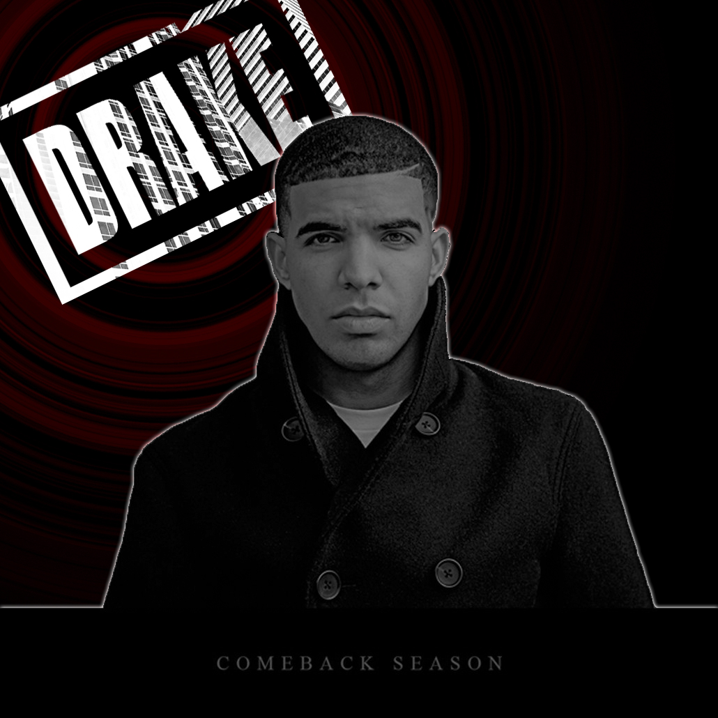
This is a album cover I made for Drake as you see i put him in black and white and the background to his left is in colour; i liked this effect I did due to the fact it made it look original; also his name was in colour making that feature stand out. This is good because his name our what people know this is his sort of reputation just by seeing his name, by it being colourful and easy to see it makes it easier to catch out target audience eye therefore maybe making more people buy the album; this is a selling technique.
I tried with this album cover to make it simple but still up to a very high standard to what a professional album cover would look like. This was good because it saved me time making as it was a very simple idea to edit and create in photoshop; but even though it was not complex it still has that effectiveness to the target audience and because of this I am happy. Simple in my view is sometimes better and on this album cover it is a prime example.
The writing of his album is plain simple text and is below Drake; I did this because in my view it is the least important feature of the album and having it small but still see able was the best choice in my option. I did not make it so small that the target audience cant see it but I main it a perfect size so it is viewable but the audience see the artist name first.
The little red pattern in the background is just to add a bit of colour into the album cover; as it is black and white all the way through but that part. This takes away the boring and dull album and adds colour making it look more attractive to the eye of the target audience.
This album cover the artist is in the middle of the album; I did this because as it was a basic and simple idea I decided to keep everything simple therefore going along with normal album cover techniques and putting Drake in the centre of the cover.
Overall I am very happy with the album cover I created as it was simple but effective and up to the high standard we are looking for in are final album cover design. The whole album cover just shows how simple is sometimes better then complex and also saves time making; this is what I wanted to show my team that we don't have to have a complex idea to get a really good album cover maybe keeping it simple is the best way.

We all had to create an album cover for our artist. I created this design from nothing on photoshop. I tried to include as many unique ideas as i could because i wanted to create a album cover which was totally different from everyone else so we stood out more. different is better in my view therefore I made the cover completely different to what i have ever seen on a album cover before.
This is my design for the album front cover. I like this idea because it just shows him and how he wants so much from his life and he is so ambitious but he never really has it; I tried to base this front over to make it seem like his life is fun in some way but on the other hand its quite boring which is represented due to the black and dark colours.
As you see the album cover is called 'Ambitious' and as he is standing on a mountain with his pose of him mostly letting free of himself, it shows how ambitious he is setting what i named the album relevant to what I created the album cover to be. He reached the top of the mountain showing that he does not give up creating again relation to the album name and making the whole album cover make sense.
I inserted the black misty sky in the background to set the whole scene of the album; as it is about his life he has been through a rough upbringing as the clouds show in the background but also it is time for his new amazing life to start that's why he is doing that pose of freedom on the top of the mountain showing the audience that he has been though the rough now he is going into the good life he had always wanted.
I inserted the moon in the back of the album cover just to set the scene even more and just to make it look a bit better and more professional. The moon has not much relevance to the album at all it just makes the whole scene of him on top of mountain more effective to look at.
I made the album covers name quite big to make sure that the album name got stuck into there had as it is very relevant to our whole album. I also added the effect that on the floor it had a sort of shadow which made the whole title of the album much more effective and looked professional.
overall i'm very happy with my design i made for the album cover as it is all relevant to what the album is about. Also it looks up to the standard of a album cover I would be happy to do for our final design therefore overall i am very please. I wanted to create a unique album cover and with what i have done I believe I have done so and done so with class and standard as well which has made me very happy.
No comments:
Post a Comment