Digipack Draft
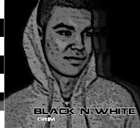
This is my draft is panel digipack. I have used elements from my mock album covers and new ideas to create it. We took a variety of pictures of Josh that we could use to create our album covers and we could all use any of the pictures. I have chosen just two pictures for my draft digipack the first is an close up picture of Josh with his hood up looking away from the camera. This shot was influenced after I had looked at other alum covers and magazines as quite often you see the artist looking to the side of the audience rather than directly at them so I thought my first picture would be quite suited for Hip-Hop. The second picture I chose was a mid shot of Josh standing up with his hood down, I decided to use a picture of Josh in the same clothing so I could maintain consistency throughout my album cover to make it look effective. I have used one font throughout the entire digipack again to maintain the same effect, also I have used a black and white colour scheme to make sure that my digipack fitted the name.
This is the front cover of my digipack, I have used the same fading effect I used in my mock up covers on the picture to add interest and make it look appealing. Also I have played around with the characteristics of the photo so I could create an effect to make it look as if the image had been painted rather than a photo. I thought this again was a good effect that helped add to my album cover. I have added a black and white bar down the side of my album cover this was influenced by Kanye West's album heartbreaks and 808's as he uses a very similar effect. I have chosen a clear font for the title and added an outline to help it stand out.
This is the back of my album, I have gone for the traditional theme of listing the tracks on the back as it helps make it look realistic and clear that it is an album cover. I have used the same effect on the photo in this shot to maintain continuity and too make sure my album fitted together, but I have chose a different picture so that I could make sure each part of the digipack was recognizably different. The final touch to the back cover was a bar code, again I have added this to create some realism as often you will find the bar code on the back of an album
This is the inside page of the album, as you open up the front cover you will see this page below it. I have added the album name and artist name again to show that this is part of the album and also I have added a quite from one of his most popular songs as this quote in particular helps explain the album name. I haven't added any effects to this page as I thought a Hip-Hop cover is more about looking smooth and sleek than going to over the top with effects.
This page is on the back of the front cover so as you lift up the front cover you will see this page on the back. I have added an army styled background to this as I thought it looked quite effective and I had already seen it on one of Kid Cudi's album covers and liked the look. Also I have used the same font I chose from the mock up cover which I downloaded from www.dafont.com and again I have added a distorted, shadow effect to the letter 'B' to help make the text look more interesting. I have coloured the text in white to create a contrast so instead of sticking to colouring the word black in black I have made it white to make it stand out.
This page is on the other side of the back cover and will be revealed once the front cover and the inside page have been lifted up. I have added the same background effect so that when the pack is fully open the image will spread right across all three pages. Also I have added the same effect to the text and I have also coloured it half black and half white. To do this I had create two 'N' colour one black one white then cut them in half and place them next to each other, the end result creating an effect of one 'N' in two colours.

This is the last part of my digipack and the part that will hold the CD. Again I have carried out the effect on the background and text from the last two pages and I have also added a CD picture. I have also coloured the text in black rather than white to help make it stand out. The CD image didn't cut out very well so I have had to blur the outlines this didn't look very effective and will have to fixed for my final cover. Other than this I am quite happy with my digipack and after a few tweaks I should be able to create a good quality cover.


No comments:
Post a Comment